
- June 23, 2021
- Posted by: team SOUTECH
- Category: Responsive Web Design
Converting a fixed pixel design to a fluid proportional layout
Graphic composites, or “comps,” as they are often called, exported from a program such as Photoshop, Illustrator, or Sketch all have fixed pixel dimensions. At some point, the designs need to be converted to proportional dimensions when recreating the design as a fluid layout for the browser.
There is a beautifully simple formula for making this conversion that the father of responsive web design, Ethan Marcotte, set down in his 2009 article, Fluid Grids (http://alistapart.com/article/FLUIDGRIDS):
target / context = result
Put another way, divide the units of the thing you want by the thing it lives in. Let’s put that into practice. Understanding it will enable you to convert any fixed dimension layouts into responsive/fluid equivalents.
Consider a very basic page layout intended for desktop. In an ideal world, we would always be moving to a desktop layout from a smaller screen layout; however, for the sake of illustrating the proportions, we will look at the two situations back to front.
Here’s an image of the layout:

We have now covered the essentials of fluid design. To summarize, where needed, make the dimensions of elements proportional rather than fixed. This way, designs adapt to the size of their container. And you now have the simple target / context = result formula to make the necessary calculations.
Before we go on to flexible media, we’ll cover the CSS Flexbox layout mechanism.
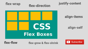
Why do we need Flexbox?
We are now going to explore using CSS Flexible Box Layout, or Flexbox as it is more commonly known. However, before we do that, I think it will be prudent to first consider the shortfalls of existing layout techniques, such as inline-block, floats, and tables. Now, if you have never used floats, CSS tables, or inline-blocks to achieve layouts before, I’d likely advise you to not bother. As we will see, there are better ways to do it now. However, if you have used any of those techniques, it’s worth reminding ourselves of the pain points.
Inline-block and white-space
The biggest issue with using inline-block as a layout mechanism is that it renders a space between HTML elements. This is not a bug (although most developers would welcome a sane way to remove the space), but it does require a few hacks to remove the space when it’s unwanted, which, for me, is about 95% of the time. There are a bunch of ways to do this. However, rather than list each possible workaround for removing the white-space when using inline-block, refer to this article by the irrepressible Chris Coyier: http://css-tricks.com/fighting-the-space-between-inline-block-elements/.
It’s also worth pointing out that there is no simple way to vertically center content within an inline-block. Using inline-block, there is also no way of having two sibling elements where one has a fixed width and another fluidly fills the remaining space.
Floats
I hate using floats for layout. There, I said it. In their favor, they work everywhere fairly consistently. However, there are two major irritations.
Firstly, when specifying the width of floated elements in percentages, their computed widths don’t get rounded consistently across browsers (some browsers round up, some down). This means that, sometimes, sections will drop down below others when not intended, and at other times they can leave an irritating gap at one side.
Secondly, you usually have to “clear” the floats so that parent boxes/elements don’t collapse. It’s easy enough to do this, but it’s a constant reminder that floats were never intended to be used as a robust layout mechanism.
Table and table-cell
Don’t confuse display: table and display: table-cell with the equivalent HTML elements. These CSS properties merely mimic the layout of their HTML-based brethren. They in no way affect the structure of the HTML.
In years gone by, I’ve found enormous utility in using CSS tables for layout. For one, using display: table with a display: table-cell child enabled consistent and robust vertical centering of elements. Also, table-cell elements inside table elements space themselves perfectly; they don’t suffer rounding issues like floated elements. You also get browser support all the way back to Internet Explorer 7!
However, there are limitations. Generally, it’s necessary to wrap an extra element around items—to get perfect vertical centering, a table-cell must live inside an element set as a table. It’s also not possible to wrap items set as display: table-cell on to multiple lines.
In conclusion, all of the existing layout methods have severe limitations. Thankfully, Flexbox overcomes them all.
Cue the trumpets and roll out the red carpet. Here comes Flexbox.
Introducing Flexbox
Flexbox addresses the shortfalls in each of the aforementioned display mechanisms. Here’s a brief overview of its superpowers:
- It can easily center contents vertically.
- It can change the visual order of elements.
- It can automatically space and align elements within a box, automatically assigning available space between them.
- Items can be laid out in a row, a row going in the reverse direction, a column down the page, or a column going in reverse order up a page.
- It can make you look 10 years younger (probably not, but in low numbers of empirical tests (me), it has been proven to reduce stress).
Leave prefixing to someone else
Writing Flexbox code to gain the widest possible browser support is a tough task by hand. Here’s an example; I’m going to set three Flexbox-related properties and values. Consider this:
.flex {

  display: flex;

  flex: 1;

  justify-content: space-between;

}
That’s how the properties and values would look in the official syntax. However, if we want support for Android browsers (v4 and below) and IE 10, here is what would actually be needed:
.flex {

  display: -webkit-box;

  display: -webkit-flex;

  display: -ms-flexbox;

  display: flex;

  -webkit-box-flex: 1;

  -webkit-flex: 1;

  -ms-flex: 1;

  flex: 1;

  -webkit-box-pack: justify;

  -webkit-justify-content: space-between;

  -ms-flex-pack: justify;

  justify-content: space-between;

}
I don’t know about you, but I’d rather spend my time doing something more productive than writing out that little lot each time! In short, if you want or need the broadest level of browser support for Flexbox, take the time to set up an autoprefixing solution.
Choosing your autoprefixing solution
For the sake of your sanity, to accurately and easily add vendor prefixes to CSS, use some form of automatic prefixing solution. Right now, I favor Autoprefixer (https://github.com/postcss/autoprefixer). It’s fast, easy to set up, and very accurate.
There are versions of Autoprefixer for most setups; you don’t necessarily need a command line-based build tool (such as Gulp or Grunt). For example, if you use Sublime Text, there is a version that will work straight from the command palette: https://github.com/sindresorhus/sublime-autoprefixer. There are also versions of Autoprefixer for Atom, Brackets, Visual Studio Code, and more.
From this point on, unless essential to illustrate a point, there will be no more vendor prefixes in the code samples.
Getting Flexy
Flexbox has four key characteristics: direction, alignment, ordering, and flexibility. We’ll cover all of these characteristics and how they relate to each other by way of a few examples.
The examples are deliberately simplistic; we are just moving some boxes and their content around so that we can understand the principles of how Flexbox works.
Perfect vertically centered text

Here’s the markup:
<div class="CenterMe">

  Hello, I'm centered with Flexbox!

</div>

Here is the entire CSS rule that's styling that markup:

.CenterMe {

  background-color: indigo;

  color: #ebebeb;

  font-family: 'Oswald', sans-serif;

  font-size: 2rem;

  text-transform: uppercase;

  height: 200px;

  display: flex;

  align-items: center;

  justify-content: center;

}
The majority of the property/value pairs in that rule are merely setting the colors and font sizes. The three properties we are interested in are:
.CenterMe {

  /* other properties */

  display: flex;

  align-items: center;

  justify-content: center;

}
If you have not used Flexbox or any of the properties in the related Box Alignment specification (http://www.w3.org/TR/css3-align/), these properties probably seem a little alien. Let’s consider what each one does:
- display: flex: This is the bread and butter of Flexbox. This merely sets the item to be a Flexbox, as opposed to a block or inline-block.
- align-items: This aligns the items within a Flexbox in the cross axis, vertically centering the text in our example.
- justify-content: This sets the main axis, centering the content. With a Flexbox row, you can think of it as the button in a word processor that sets the text to the left, right, or center (although there are additional justify-content values we will look at shortly).
OK, before we get further into the properties of Flexbox, we will consider a few more examples:
Offset items
How about a simple list of navigation items, but with one offset to one side?
Here’s what it looks like:
Here’s the markup:
<div class="MenuWrap">

  <a href="#" class="ListItem">Home</a>

  <a href="#" class="ListItem">About Us</a>

  <a href="#" class="ListItem">Products</a>

  <a href="#" class="ListItem">Policy</a>

  <a href="#" class="LastItem">Contact Us</a>

</div>
And here is the CSS:
.MenuWrap {

background-color: indigo;

font-family: 'Oswald', sans-serif;

font-size: 1rem;

min-height: 2.75rem;

display: flex;

align-items: center;

padding: 0 1rem;

}

.ListItem,

.LastItem {

color: #ebebeb;

text-decoration: none;

}

.ListItem {

margin-right: 1rem;

}

.LastItem {

margin-left: auto;

}
When you set display: flex; on a wrapping element, the children of that element become flex items, which then get laid out using the flex layout model. The magical property here is margin-left: auto, which makes that item use all of the available margin on that side.
Reverse the order of items
Want to reverse the order of the items?

It’s as easy as adding flex-direction: row-reverse; to the wrapping element and changing margin-left: auto to margin-right: auto on the offset item:
.MenuWrap {
background-color: indigo;
font-family: ‘Oswald’, sans-serif;
font-size: 1rem;
min-height: 2.75rem;
display: flex;
flex-direction: row-reverse;
align-items: center;
padding: 0 1rem;
}
.ListItem,
.LastItem {
color: #ebebeb;
text-decoration: none;
}
.ListItem {
margin-right: 1rem;
}
.LastItem {
margin-right: auto;
}
How about if we want them laid out vertically instead?
Simple. Change to flex-direction: column; on the wrapping element and remove the auto margin:
.MenuWrap {
background-color: indigo;
font-family: ‘Oswald’, sans-serif;
font-size: 1rem;
min-height: 2.75rem;
display: flex;
flex-direction: column;
align-items: center;
padding: 0 1rem;
}
.ListItem,
.LastItem {
color: #ebebeb;
text-decoration: none;
}
Column reverse
Want them stacked in the opposite direction? Just change to flex-direction: column-reverse; and you’re done.


