
- June 14, 2021
- Posted by: team SOUTECH
- Category: Responsive Web Design

We’ve discussed already that people tend to just use the term HTML rather than HTML5 these days, but that label was important historically in relation to media. Before HTML5, adding video and audio into markup was a bit of a pain. These days it’s easy.
Adding video and audio in HTML
Video and audio in HTML is easy. Here’s a “simple as can be” example of how to link to a video file in your page:
<video src=”myVideo.mp4″></video>
HTML allows a single <video></video> tag (or <audio></audio> for audio) to do all the heavy lifting. It’s also possible to insert text between the opening and closing tag to inform users when there is a problem. There are also additional attributes you’d ordinarily want to add, such as the height and width. Let’s add these:
<video src=”myVideo.mp4″ width=”640″ height=”480″>If you’re reading this either the video didn’t load or your browser is waaaayyyyyy old!</video>
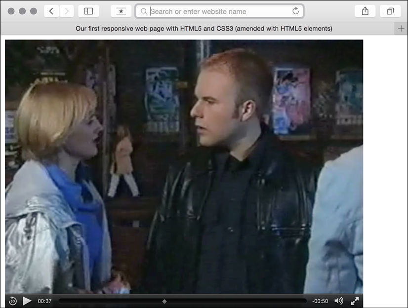
Now, if we add the preceding code snippet into our page and look at it in some browsers, it will appear but there will be no controls for playback. To ensure we show the default playback controls we need to add the controls attribute. For the sake of illustration, we could also add the autoplay attribute. However, I’d recommend against that in real-world scenarios—everyone hates videos that auto-play! Here’s an example with the controls and autoplay attributes added:
<video src=”myVideo.mp4″ width=”640″ height=”480″ controls autoplay>If you’re reading this either the video didn’t load or your browser is waaaayyyyyy old!</video>
The result of the preceding code snippet is shown in the following screenshot:
Further attributes include preload to control preloading of media, loop to repeat the video, and poster to define a poster frame for the video, the image that shows while a video loads. To use an attribute, simply add it to the tag. Here’s an example including all these attributes:
<video src=”myVideo.mp4″ width=”640″ height=”480″ controls autoplay preload=”auto” loop poster=”myVideoPoster.png”> If you’re reading this either the video didn’t load or your browser is waaaayyyyyy old!</video>
Providing alternate media sources
The <source> tag enables us to provide alternate sources for media. For example, alongside providing an MP4 version of a video, if we wanted to provide support for a new format, we could easily do so. Furthermore, if the user didn’t have any suitable playback technology in the browser, we could provide download links to the files themselves. Here’s an example:
<video width="640" height="480" controls preload="auto" loop poster="myVideoPoster.png">

<source src="myVideo.sp8" type="video/super8" />

<source src="myVideo.mp4" type="video/mp4" />

<p><b>Download Video:</b> MP4 Format: <a href="myVideo.mp4">"MP4"</a></p>

</video>
In that case, we first specified the source of a made-up video format called super8. The browser goes top to bottom deciding what to play, so if it doesn’t support super8, it moves on to the next source, mp4 in this case. And on and on it goes, moving down to the download link if it can’t reconcile any of the sources listed. The type attribute tells the browser the MIME type of the resource. If you fail to specify this, the browser will fetch the content and try to play it anyway. But if you know the MIME type, you should add it in the type attribute. The prior code example and the sample video file (which, incidentally, is me appearing in the UK soap Coronation Street back when I had hair and hopes of starring alongside DeNiro) in MP4 format are in the example2 section of the chapter’s code.
Audio and video tags work almost identically
The <audio> tag works on the same principles as the video tag, with the same attributes (excluding width, height, and poster). The main difference between the two is the fact that <audio> has no playback area for visible content.
Responsive HTML5 video and iframes
The only problem with our lovely HTML video implementation is it’s not responsive. That’s right, an example in a book about responsive web design with HTML5 and CSS that doesn’t respond. Thankfully, for HTML embedded video, the fix is easy. Simply remove any height and width attributes in the markup (for example, remove width=”640″ height=”480″) and add the following in the CSS:
video {

max-width: 100%;

height: auto;

}
However, while that works fine for files that we might be hosting locally, it doesn’t solve the problem of videos embedded within an iframe (take a bow YouTube, Vimeo, et al.) The following code will add a film trailer for Midnight Run from YouTube:
<iframe width="960" height="720" src="https://www.youtube.com/embed/B1_N28DA3gY" frameborder="0" allowfullscreen></iframe>
However, if you add that to a page as is, even if adding that earlier CSS rule, if the viewport is less than 960px wide, things will start to get clipped.
The easiest way to solve this problem is with a little CSS trick pioneered by Gallic CSS maestro Thierry Koblentz here: http://alistapart.com/article/creating-intrinsic-ratios-for-video. Essentially, he is creating a box of the correct aspect ratio for the video it contains. I won’t spoil the magician’s own explanation, go take a read.
If you’re feeling lazy, you don’t even need to work out the aspect ratio and plug it in yourself; there’s an online service that can do it for you. Just head to http://embedresponsively.com/ and paste your iframe URL in. It will spit you out a simple chunk of code you can paste into your page.
For example, our Midnight Run trailer results in this (note the padding-bottom value to define the aspect ratio):
<style>

.embed-container {

position: relative;

padding-bottom: 56.25%;

height: 0;

overflow: hidden;

max-width: 100%;

height: auto;

}

.embed-container iframe,

.embed-container object,

.embed-container embed {

position: absolute;

top: 0;

left: 0;

width: 100%;

height: 100%;

}

</style>

<div class="embed-container">

<iframe

src="http://www.youtube.com/embed/B1_N28DA3gY"

frameborder="0"

allowfullscreen

></iframe>

</div>
That’s all there is to it! Simply add it to your page and you’re done: we now have a fully responsive YouTube video.


