
- April 23, 2019
- Posted by: SouTech Team
- Category: Blog, Blogging, Development, Digital Marketing, Freelancing, Graphics and Branding, Graphics and Branding Training
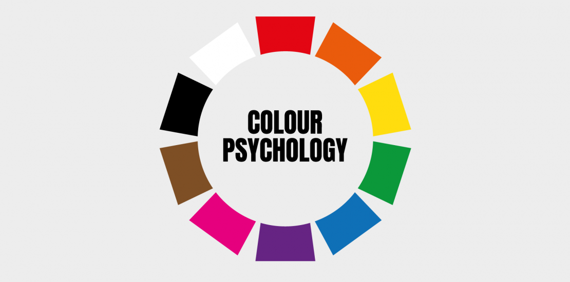
Understanding Color Psychology
Color Psychology is the study of how various colors affect human behavior. It broadens to explain the psychological impact of different color hues on human perceptions, decisions and taste. Our choice of a color determines why we would prefer some brand over the other. This is crystal because a particular color can have a varying interpretation or perhaps an intuitive affinity to different people which concomitantly affects their brand choice. Also worthy to note is the fact that several factors such as gender, age and culture have a significant impact on individual’s perception of a color. The aforementioned factors are vital to be clearly considered when making preferred color choice for a brand as it could make or mar affects.
RED: The color Red is associated with courage, intensity, encourages appetite, love, strength, warmth, energy, basic survival, ‘fight or flight, stimulation, masculinity, excitement, passion, action. Red draws attention and creates movement. It could also mean danger, defiance, aggression, visual impact, strain and hostility.
BLUE: Blue symbolizes intelligence, communication, trust, efficiency, serenity, duty, logic, coolness, reflection, calm and tranquility, intellectual, unique and authentic, flexible and imaginative. It further connotes confidence, loyalty, integrity and responsibility. While associated with water, it can mean peace. Blue while relating to stability and harmony however, sends an uncaring message of coldness, aloofness, lack of emotion, unfriendliness. Most tech websites and brand use blue color for their navigation tab on icons to show reliability and guarantee.
GREEN: The color green represents nature. It represents growth, money, fertility, health, balance. The color further symbolizes harmony, balance, refreshment, universal love, rest, restoration, reassurance, environmental awareness, equilibrium, peace. It is also associated with depth and freshness. However, its negative representation include Boredom, stagnation, blandness, enervation. Because our environment is green, the immediate interpretation of green is that of health, nature and comfort. Green is identified with creativity, endurance and healing. Most brands that use green revolve around agriculture and health.
YELLOW: The color psychological meaning for yellow revolves around energy, self-esteem, friendliness, sunshine. It instigates the feelings of optimism, confidence, creativity, happiness, positivity, extraversion and optimism. The color indicates honor and loyalty. It also has joy, cheerfulness and intellect. Most brands use a cheerful yellow color as the background or border for their website design. A small touch of yellow can help website visitors associate your store with positive perceptions; but if used wrongly on a brand or graphics and especially on a website, yellow evokes a hostile feeling and can strain eyes and cause eye fatigue.
Emotionally, yellow evokes the feeling of irrationality, fear, emotional fragility, depression, anxiety, suicide. Also, it connotes deceit and warning.
ORANGE: The orange color is a combination of red and yellow and as such combines the energy of red and the happiness of yellow. Orange represents creativity, adventure, success, sensuality, physical comfort, food, warmth, security, passion, abundance, fun, balance and abundance. It is general a fun color. It focuses on physical comfort and warmth. Further, the color orange adds liveliness and fun to a brand, website, or marketing material.
Negatively, it means frustration, immaturity, deprivation. The li;’[ight orange can be contradictory against a black color. Also, too much orange represents frivolity.
BLACK: Black is basically an absence of light. Black represents glamour, elegance, power, mystery, security, efficiency, substance. Black creates an impression of seriousness and sophistication. In clearer terms, black connotes clarity and distinctness. Black creates a seeming safe/protective haven. It also creates an impression of oppression, death, hidden, fear, evil, coldness, menace, grief, heaviness and formality.
WHITE: In color psychology, white represents purity, innocence, light and goodness. It represents a perfect reflection. White gives an elevated impression of space. It means simplicity, faith, clarity, safety, virginity. White strikes a perfect show-off against a black fade. In color psychology, white reflects hygiene, sterility, clarity, purity, cleanness, simplicity, sophistication, efficiency. White usually has a positive connotation and can represent a successful beginning.
Here at SOUTECH, we give the best training and services for all your graphics need. To Contact Us, Partner and get more of our Services, click the link below:
Related posts:
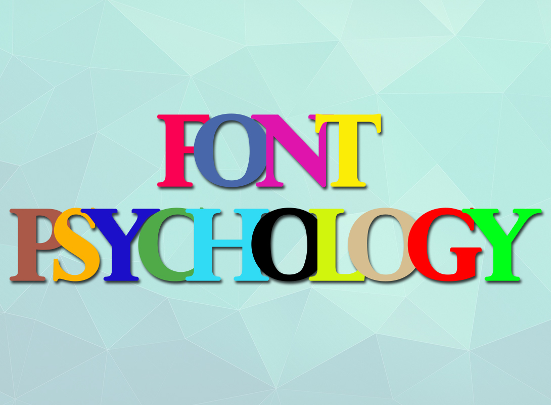 FONT PSYCHOLOGY: USAGE AND RULES
 Simple Guide through Photoshop Tools and Options
 How to Create Clipping Mask in Photoshop
Professional Training Videos for Microsoft, Comptia , AutoCAD, Graphics and Branding, SPSS, Motivational in Abuja, Nigeria
Professional Graphics and Branding Training Program in Abuja, Lagos, PH Nigeria- SOUTECH Web Consults
How to Create Clipping Mask in Photoshop
Professional Training Videos for Microsoft, Comptia , AutoCAD, Graphics and Branding, SPSS, Motivational in Abuja, Nigeria
Professional Graphics and Branding Training Program in Abuja, Lagos, PH Nigeria- SOUTECH Web Consults