
- July 1, 2021
- Posted by: team SOUTECH
- Category: Responsive Web Design
Different Flexbox layouts with media queries
As the name suggests, Flexbox is inherently flexible, so how about we go for a column list of items at smaller viewports and a row style layout when space allows? It’s a piece of cake with Flexbox. In fact, we have already used that technique in the last chapter. Do you remember the header of the https://rwd.education website we started?
Here is the relevant section again:
.rwd-MastHead {

display: flex;

flex-direction: column;

}

@media (min-width: 1200px) {

.rwd-MastHead {

flex-direction: row;

justify-content: space-between;

max-width: 1000px;

margin: 0 auto;

}

}
At the outset, we set the content to flow in a column down the page, with the logo and navigation links one below the other. Then, at a minimum width of 1200px, we make those elements display as a row, one at either side. The space between them is provided by the justify-content property. We will look at this in more detail very shortly.
Inline-flex
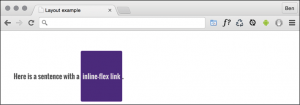
Flexbox has an inline variant to complement inline-block and inline-table. As you might have guessed, it is display: inline-flex;. Thanks to its beautiful centering abilities, you can do some wacky things with very little effort:
Here’s the markup:
<p>

Here is a sentence with a

<a

href="http://www.w3.org/TR/css-flexbox-1/#flex-containers"

class="InlineFlex"

>inline-flex link</a

>.

</p>
And, using the same basic styles as the previous examples for the fonts, font size and colors, here is the CSS needed:
.InlineFlex {

display: inline-flex;

align-items: center;

height: 120px;

padding: 0 4px;

background-color: indigo;

text-decoration: none;

border-radius: 3px;

color: #ddd;

}
When items are set as inline-flex anonymously, which happens if their parent element is not set to display: flex, then they retain whitespace between elements, just like inline-block or inline-table do. However, if they are within a flex container, then whitespace is removed, much as it is with CSS table-cell items within a CSS table. Of course, you don’t always have to center items within a Flexbox. There are a number of different options. Let’s look at those now.
Flexbox alignment properties
Remember, the example code you download will be at the point where we finish this section, so if you want to “work along,” you may prefer to delete all the HTML inside the <body> tag, and all the class based CSS rules in the example file, and start again.
The important thing to understand with Flexbox alignment is the concept of the axis. There are two axes to consider, the “main axis” and the “cross axis.” What each of these represents depends on the direction the Flexbox is set to. For example, if the direction of your Flexbox is set to row, the main axis will be the horizontal axis and the cross axis will be the vertical axis.
Conversely, if your Flexbox direction is set to column, the main axis will be the vertical axis and the cross axis will be the horizontal axis.
Here’s the basic markup of our example:
<div class="FlexWrapper">

<div class="FlexItem">I am content in the inner Flexbox.</div>

</div>

Let's set a few basic Flexbox-related styles:

.FlexWrapper {

background-color: indigo;

display: flex;

height: 200px;

width: 400px;

}

.FlexItem {

background-color: #34005b;

display: flex;

height: 100px;

width: 200px;

}
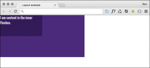
In the browser, that produces this:
Right, let’s test drive the effects of some of these properties.
The align-items property
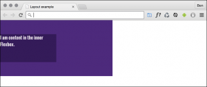
The align-items property positions items in the cross axis. If we apply this property to our wrapping element, like so:
.FlexWrapper {

background-color: indigo;

display: flex;

height: 200px;

width: 400px;

align-items: center;

}
As you would imagine, the item within that box gets centered vertically:
The same effect would be applied to any number of children within.
The align-self property
Sometimes, you may want to pull just one item into a different alignment. Individual flex items can use the align-self property to align themselves. At this point, I’ll remove the previous alignment properties in the CSS. I’ll also add another two div elements to the markup, both also with a class of FlexItem. In the middle of these three items, I’ll add an additional HTML class of AlignSelf. We’ll use that class in the CSS to add the align-self property.
So, here’s the HTML:
<div class="FlexWrapper">

<div class="FlexItem">I am content in the inner Flexbox 1</div>

<div class="FlexItem AlignSelf">I am content in the inner Flexbox 2</div>

<div class="FlexItem">I am content in the inner Flexbox 3</div>

</div>
And here is the CSS:
.FlexWrapper {

background-color: indigo;

display: flex;

height: 200px;

width: 400px;

}

.FlexItem {

background-color: #34005b;

display: flex;

height: 100px;

width: 200px;

}

.AlignSelf {

align-self: flex-end;

}
Here is the effect in the browser:
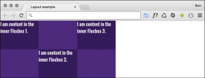
Wow! Flexbox really makes these kinds of changes trivial. In that example, the value of align-self was set to flex-end. Let’s consider the possible values we could use on the cross axis before looking at alignment in the main axis.
Possible alignment values
For cross-axis alignment, Flexbox has the following possible values:
- flex-start: Setting an element to flex-start would make it begin at the “starting” edge of its flex container.
- flex-end: Setting to flex-end would align the element at the end of the flex container.
- center: This puts it in the middle of the flex container.
- baseline: This sets all the flex items in the container so that their baselines align.
- stretch: This makes the items stretch to the size of their flex container (in the cross axis).
There are some particulars inherent to using these properties, so if something isn’t playing happily, always refer to the specification for any edge case scenarios: http://www.w3.org/TR/css-flexbox-1/#align-items-property.
The justify-content property
Alignment in the main axis is controlled with justify-content. Possible values for justify-content are:
- flex-start
- flex-end
- center
- space-between
- space-around
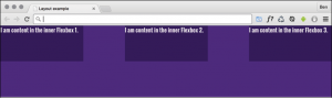
The first three do exactly what you would now expect. However, let’s take a look at what space-between and space-around do. Consider this markup:
<div class="FlexWrapper">

<div class="FlexItem">I am content in the inner Flexbox1.</div>

<div class="FlexItem">I am content in the inner Flexbox2.</div>

<div class="FlexItem">I am content in the inner Flexbox3.</div>

</div>
And then consider this CSS. We are setting the three div elements with a class of FlexItem to each be 25% width, wrapped by a flex container, with a class of FlexWrapper, set to be 100% width:
.FlexWrapper {

background-color: indigo;

display: flex;

justify-content: space-between;

height: 200px;

width: 100%;

}

.FlexItem {

background-color: #34005b;

display: flex;

height: 100px;

width: 25%;

}
As the three items will only take up 75% of the available space, justify-content explains what we would like the browser to do with the remaining space. A value of space-between puts an equal amount of space between the items, and space-around puts it around the items. Perhaps a screenshot here will help – this is space-between:
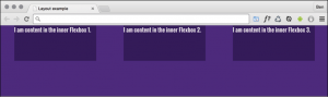
And here is what happens if we switch to space-around:
The other alignment property I find myself using from time to time is space-evenly. This takes the available space and adds an equal amount to every gap.
The various alignment properties of Flexbox are currently being specified in CSS Box Alignment Module Level 3. This should give the same fundamental alignment powers to other display properties, such as display: block; and display: table. The specification is still being worked on, so you can keep checking the status at http://www.w3.org/TR/css3-align/.

