
- July 1, 2021
- Posted by: team SOUTECH
- Category: Responsive Web Design

Wrapping with flex
By default,
items in a flex container will shrink to fit and, if they can’t, they will overflow the container.
For example, consider this markup:
<div class="container">

<div class="items">Item 1</div>

<div class="items">Item 2</div>

<div class="items">Item 3</div>

<div class="items">Item 4</div>

</div>


And this CSS:


.container {

display: flex;

width: 500px;

background-color: #bbb;

align-items: center;

border: 1px solid #111;

}

.items {

color: #111;

display: inline-flex;

align-items: center;

justify-content: center;

font-size: 23px;

flex: 0 0 160px;

height: 40px;

border: 1px dashed #545454;

}
You may be wondering why the outer container is set with a width and not the flex shorthand property we looked at before. Remember, this is because unless the element is a flex item (inside a Flexbox itself), flex has no effect.
Because there is a width of only 500px on the flex container, those four elements don’t fit:
However, those items can be set to wrap with flex-wrap: wrap. This wraps the items once they hit the edge of the container.
The likelihood is that there will be times when you want flex items to wrap and other times when you don’t. Remember that the default is to not wrap, but you can easily make the change with a single line.
Also, remember that you can set the wrapping by itself with flex-wrap, or as part of the flex-flow direction and wrap shorthand.
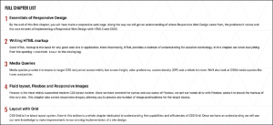
Let’s solve a real-world problem with flex-wrap. Consider this list of paragraphs in the following image. At this width, they are not easy to read.
Let’s amend that layout with a media query and a few choice flex properties. I’m consolidating all of these changes into one media query here for brevity, but remember that you can use as many as you like to organize your code however you see fit. We covered the options extensively in Media Queries – Supporting Differing Viewports:
@media (min-width: 1000px) {

.rwd-Chapters_List {

display: flex;

flex-wrap: wrap;

}

.rwd-Chapter {

flex: 0 0 33.33%;

padding: 0 20px;

}

.rwd-Chapter::before {

left: -20px;

}

}
And that produces this effect in the browser:
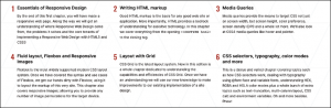
We made the container of the chapters into a flex container. Then, to stop the elements scrunching up into one another, we set the container to wrap. To limit the chapter section widths to a third of the container, we used the flex shorthand to set 33.33% as the flex-basis and prevented the element from growing or shrinking. Padding was used to provide a little space between them. The final small tweak was to bring in the chapter numbers a little.
Wrapping up Flexbox
There are near endless possibilities when using the Flexbox layout system and, due to its inherent “flexiness,” it’s a perfect match for responsive design. If you’ve never built anything with Flexbox before, all the new properties and values can seem a little odd, and it’s sometimes disconcertingly easy to achieve layouts that have previously taken far more work.
The other modern layout system we have in CSS is Grid, but that’s a topic for Layout with CSS Grid. Before we get there, let’s tackle responsive images and media.
Responsive images
Serving the appropriate image to users based on the particulars of their device and environment has always been a tricky problem. This problem was accentuated with the advent of responsive web design, the very nature of which is to serve a single code base to each and every device.
The inherent problem of responsive images
As an author, you cannot know about every possible device that may visit your site now or in the future. Only a browser knows the particulars of the device viewing a website: its screen size and device capabilities, for example.
Conversely, only the people making the website know what versions of an image we have at our disposal. For example, we may have three versions of the same image: small, medium, and large; each with increasing dimensions to cover off the anticipated screen size and screen density eventualities. The browser does not know this. We have to tell it.
To summarize the conundrum, we, as the website authors, have only half of the solution, in that we know what images we have. The browser has the other half of the solution in that it knows what device is visiting the site and what the most appropriate image dimensions and resolution would be.
How can we tell the browser what images we have at our disposal so that it may choose the most appropriate one for the user?
In the first few years of responsive web design, there was no specified way. Thankfully, now we have the Embedded content specification: https://html.spec.whatwg.org/multipage/embedded-content.html.
The Embedded content specification describes ways to deal with the simple resolution switching of images—to facilitate a user on a higher resolution screen receiving a higher resolution version of images. It also facilitates “art direction” situations for when authors want users to see a totally different image, depending on a number of device characteristics (think media queries). For example, a close-up image of something on smaller viewports and then a wide-angle image of the same thing for larger viewports.
Demonstrating responsive image examples is tricky. It’s not possible to appreciate on a single screen the different images that could be loaded with a particular syntax or technique. Therefore, the examples that follow will be mainly code, and you’ll just have to trust me that’s it’s going to produce the result you need in supporting browsers.
Let’s look at the two most common scenarios you’re likely to need responsive images for. These are switching one image for another when a different resolution is needed and changing an image entirely depending on the available viewport space.
Simple resolution switching with srcset
Let’s suppose you have three versions of the same image. One is a smaller size for smaller viewports, another caters for medium-sized viewports, and, finally, a larger version covers off every other viewport. Here is how we can let the browser know that we have these three versions available:
<img

src="scones_small.jpg"

srcset="scones_medium.jpg 1.5x, scones_large.jpg 2x"

alt="a delicious looking baked scone"

/>


This is about as simple as things get with responsive images, so let's ensure that the syntax makes perfect sense.

First of all, the src attribute, which you will already be familiar with, has a dual role here; it's specifying the small 1x version of the image, and it also acts as a fallback image if the browser doesn't support the srcset attribute. That's why we are using it for the small image. This way, older browsers that will ignore the srcset information will get the smallest and best-performing image possible.

For browsers that understand srcset, with that attribute, we provide a comma-separated list of images that the browser can choose from. After the image name (such as scones_medium.jpg), we issue a simple resolution hint.

I've specifically called it a hint rather than an instruction or a command, and you will see why in a moment. In this example, 1.5x and 2x have been used but any integer would be valid. For example, 3x or 4x would work too (providing you can find a suitably high-resolution screen).

However, there is an issue here; a device with a 1440px wide, 1x screen will get the same image as a 480px wide, 3x screen. That may or may not be the desired effect.

<strong>Advanced switching with srcset and sizes</strong>

Let's consider another situation. In a responsive web design, it wouldn't be uncommon for an image to be the full viewport width on smaller viewports, but only half the width of the viewport at larger sizes. The main example in <em>Chapter 1, The Essentials of Responsive Web Design</em>, was a typical example of this. Here's how we can communicate these intentions to the browser:


<img

srcset="scones-small.jpg 450w, scones-medium.jpg 900w"

sizes="(min-width: 280px) 100vw, (min-width: 640px) 50vw"

src="scones-small.jpg"

alt="Lots of delicious scones"

/>


Inside the image tag, we are utilizing srcset again. However, this time, after specifying the images, we are adding a value with a w suffix. This tells the browser how wide the image is. In our example, we have a 450px wide image (called scones-small.jpg) and a 900px wide image (called scones-medium.jpg). It's important to note this w-suffixed value isn't a "real" size. It's merely an indication to the browser, roughly equivalent to the width in "CSS pixels."

What exactly defines a pixel in CSS? I wondered that myself. Then, I found the explanation at <a href="http://www.w3.org/TR/css3-values/#reference-pixel">http://www.w3.org/TR/css3-values/#reference-pixel</a> and wished I hadn't wondered.

This w-suffixed value makes more sense when we factor in the sizes attribute. The sizes attribute allows us to communicate the intentions for our images to the browser. In our preceding example, the first value is equivalent to "for devices that are at least 280px wide, I intend the image to be around 100vw wide."

If some of the units used, such as vh (where 1vh is equal to 1% of the viewport height) and vw (where 1vw is equal to 1% of the viewport width), don't make sense, be sure to read<em> CSS Selectors, Typography, Color Modes, and More</em>.

The second part is, effectively, "Hi browser, for devices that are at least 640px wide, I only intend the image to be shown at 50vw." That may seem a little redundant until you factor in DPI (or DPR for device pixel ratio). For example, on a 320px wide device with a 2x resolution (effectively requiring a 640px wide image, if shown at full width), the browser might decide the 900px wide image is actually a better match as it's the first option it has for an image that would be big enough to fulfill the required size.

Did you say the browser "might" pick one image over another?

An important thing to remember is that the values given in thesizesattribute are merely hints to the browser. That doesn't necessarily ensure that the browser will always obey. This is a good thing. Trust me, it really is. It means that, in the future, if there is a reliable way for browsers to ascertain network conditions, it may choose to serve one image over another because it knows things at that point that we can't possibly know at this point as the author. Perhaps a user has a setting on their device to "only download 1x images" or "only download 2x images." In these scenarios, the browser can make the best call.

The alternative to the browser deciding is to use the picture element. Using this element ensures that the browser serves up the exact image you asked for. Let's take a look at how it works.

<strong>Art direction with the picture element</strong>

The final scenario you may find yourself in is one in which you have different images that are applicable at different viewport sizes. For example, consider our cake-based example again from <em>Chapter 1</em>. Maybe on the smallest screens we would like a close-up of the scone with a generous helping of jam and cream on top. For larger screens, perhaps we have a wider image we would like to use. Perhaps it's a wide shot of a table loaded up with all manner of cakes. Finally, for larger viewports still, perhaps we want to see the exterior of a cake shop on a village street with people sat outside eating cakes and drinking tea (I know, sounds like nirvana, right?).

We need three different images that are most appropriate at different viewport ranges. Here is how we could solve this with picture:


<picture>

<source media="(min-width: 480px)" srcset="cake-table.jpg" />

<source media="(min-width: 960px)" srcset="cake-shop.jpg" />

<img src="scones.jpg" alt="Lots of cakes" />

</picture>
First of all, be aware that when you use the picture element, it is merely a wrapper to facilitate other images making their way to the img tag within. If you want to style the images in any way, it’s the img tag that should get your attention.
Secondly, the srcset attribute here works exactly the same as the previous example.
Thirdly, the img tag provides your fallback image and also the image that will be displayed if a browser understands picture but none of the media definitions match. Just to be crystal clear, do not omit the img tag from within a picture element or things won’t end well.
The key difference with picture is that we have a source tag. Here, we can use media query-style expressions to explicitly tell the browser which asset to use in a matching situation. For example, our first one in the preceding example is telling the browser, “Hey you, if the screen is at least 480px wide, load in the cake-table.jpg image instead.” As long as the conditions match, the browser will dutifully obey.
Facilitate new image formats
As a bonus, picture also facilitates us providing alternate formats of an image. “WebP” is a newer image format, pushed by Google that Apple’s Safari browser lacks support for (check whether that is still the case at http://caniuse.com/#search=WebP). It provides a comparable quality as a JPG, but in a far smaller payload. So, if a browser supports it, it makes sense to let them have that version of the image instead. For browsers that support it, we can offer a file in that format and a more common format for those that don’t:
<picture>

<source type="image/webp" srcset="scones-baby-yeah.webp" />

<img src="scones-baby-yeah.jpg" alt="delicious cakes" />

</picture>
Hopefully, this is now a little more straightforward. Instead of the media attribute, we are using type, which, although more typically used to specify video sources (possible video source types can be found here: https://html.spec.whatwg.org/multipage/embedded-content.html#attr-source-type), allows us here to define WebP as the preferred image format. If the browser can display it, it will; otherwise,


