
- July 2, 2021
- Posted by: team SOUTECH
- Category: Professional Website Design Free Training, Responsive Web Design, Website Design Training

Layout with CSS Grid
Without a doubt, the biggest “game-changer” to CSS layout has been Grid.
We now have a layout system capable of achieving everything we have done before with less code and more predictability, as well as enabling things we simply couldn’t do before!
I’d go as far as saying Grid is revolutionary rather than evolutionary. There are entirely new concepts to understand that have no real forebears in past CSS. As such, expect to take some time getting comfortable using it.
But trust me, it is worth it. Let’s go!
In this chapter, we will learn the following:
- What CSS Grid is and the problems it solves
- The essential concepts to understand when dealing with Grid layout
- Grid-specific terminology
- How to set up a grid
- How to position items in a grid
- How to create powerful responsive patterns with minimal code
- How to understand and write the grid shorthand syntax
Toward the end of the chapter, you will also be tasked with a small exercise to use some of the techniques we have learned to refactor the layout of a portion of the https://rwd.education website we have been looking at in previous chapters.
What CSS Grid is and the problems it solves
CSS Grid is a two-dimensional layout system. Flexbox, which we covered in the last chapter, concerns itself with items being laid out in a single dimension/direction at a time. A Flexbox container either lays things out in a row, or it lays them out in a column. It cannot facilitate laying out items across and down at once; that is what Grid is for.
I should point out at the outset that you don’t need to choose between Flexbox or Grid when building projects. They are not mutually exclusive. I commonly use both, even within a single visual component.
To be completely clear, when you adopt Grid, you don’t have to forsake any other display methods. For example, a Grid will quite happily allow a Flexbox inside it. Equally, part of your interface coded with Grid can quite happily live inside a Flexbox, standard block, or inline-block.
So there are times when using Grid is the most appropriate option, and there are times when Flexbox, or another layout method, is the most appropriate.
The truth is, we’ve been creating grid layouts with CSS for years. We just haven’t had a specific grid layout mechanism in CSS to do it. We have made use of blocks, floats, tables, and many other ingenious techniques to work around the fact we didn’t have a proper grid layout system in CSS. Now, thankfully, we do.
Using CSS Grid, we can create grids of virtually infinite permutations and position child elements wherever we want them, regardless of their source order. What’s more, Grid even makes provision for when additional items are added and adapts itself to the needs of the content. This might sound hyperbolic, so let’s not waste any more text. Let’s get to it.
Basic Grid syntax
In the most simple terms, to use Grid, we need to tell the browser:
- How many rows and columns our grid should have
- How those rows and columns should be sized
- Where we want to place the items of our grid
- What should happen when the size of the grid changes or more items are added to the grid
Relating that to the browser is, therefore, just a matter of understanding the terminology.
Grid-specific concepts and terminology
The first concept to understand is “explicit” and “implicit” item placement. The grid you define in your CSS with columns and rows is the explicit grid; it’s the layout of the items you have explicitly defined. Meanwhile, the implicit grid is the grid placement of items that happens when additional items you didn’t foresee also get added to the grid. The placement of these new items is implied by the layout of your explicit grid.
The next concept that commonly confuses people (it certainly did me) is that grid lines are on either side of the grid items. The bit in the middle, between the lines, is referred to as a grid “track.” Where two tracks from different directions intersect is where a “grid area” is formed.
A key takeaway is that when you place items within a grid, you can do so referencing the grid lines (which, therefore, implies a grid area) or the grid areas themselves if named.
There is no limit, theoretically, to the number of tracks a grid can have. However, browsers are at liberty to truncate grids. If you set a value beyond the browser’s limit, the grid will be truncated to that limit. Practically, I can’t imagine hitting a browser’s limit being a likely scenario, but I’m mentioning it here for completeness.
Here is the introduction to the explicit grid section of the W3C specification (https://www.w3.org/TR/css-grid-1/#explicit-grids). It’s worth rereading a few times as it is dense with essential information for understanding how the grid works:
The three properties grid-template-rows, grid-template-columns, and grid-template-areas together define the explicit grid of a grid container. The final grid may end up larger due to grid items placed outside the explicit grid; in this case implicit tracks will be created, these implicit tracks will be sized by the grid-auto-rows and grid-auto-columns properties.
The size of the explicit grid is determined by the larger of the number of rows/columns defined by grid-template-areas and the number of rows/columns sized by grid-template-rows/grid-template-columns.
Any rows/columns defined by grid-template-areas but not sized by grid-template-rows/grid-template-columns take their size from the grid-auto-rows/grid-auto-columns properties. If these properties don’t define any explicit tracks the explicit grid still contains one grid line in each axis.
Numeric indexes in the grid-placement properties count from the edges of the explicit grid. Positive indexes count from the start side (starting from 1 for the start-most explicit line), while negative indexes count from the end side (starting from -1 for the end-most explicit line).
The grid and grid-template are properties that allow a shorthand to be used to set all three explicit grid properties (grid-template-rows, grid-template-columns, and grid-template-areas) at the same time. The grid shorthand also resets properties controlling the implicit grid, whereas the grid-template property leaves them unchanged.
Now, I’m conscious that when you haven’t worked at all with Grid it can be very intimidating, and that quoted section from the specification might seem completely opaque right now. Hopefully, when you have read this chapter through, and played with Grid yourself, it will make a little more sense.
Again, don’t worry if little of that previous text made sense. Let’s start our Grid journey in code with a very simple example. First, the world’s easiest grid layout: four numbered boxes. It will look like this in the browser:
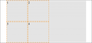
Here is the markup:
<div class="my-first-grid">

<div class="grid-item-1">1</div>

<div class="grid-item-2">2</div>

<div class="grid-item-3">3</div>

<div class="grid-item-4">4</div>

</div>
The first thing I want you to consider is that with Grid, the markup pattern is a containing element, which is the grid, and the elements of the grid are the direct children. Write the markup for grid child elements in the order that makes the most sense for the content; Grid can place them visually wherever you need it. Here is the related CSS:
.my-first-grid {

display: grid;

grid-gap: 10px;

grid-template-rows: 200px 200px;

grid-template-columns: 200px 200px;

background-color: #e4e4e4;

}

.grid-item-1 {

grid-row: 1;

grid-column: 1;

}

.grid-item-2 {

grid-row: 1;

grid-column: 2;

}

.grid-item-3 {

grid-row: 2;

grid-column: 1;

}

.grid-item-4 {

grid-row: 2;

grid-column: 2;

}

[class^='grid-item'] {

outline: 3px dashed #f90;

font-size: 30px;

color: #333;

}
The parts to concentrate on in that CSS are the grid-specific properties. I’ve added some outlines and a background to make it easier to see where the grid is and the size and shape of the grid items.
We use display: grid to set our container as a grid and then use grid-template-rows: 200px 200px to set two rows, each 200px high, and grid-template-columns: 200px 200px to set the grid to have two 200px wide columns.
In terms of the child elements of the grid, we use grid-row with a number to tell Grid which row to place the item and grid-column to tell it which column to place it in.
By default, the child elements of a grid remain as their standard layout type. Although our grid items belong to our grid, in this example, as they are all div elements, they are still computed as display: block. This is important to understand when we start trying to align grid items.
You can play about with this first example in the example_05-01 code sample.
Let’s use the alignment properties we learned about in the last chapter to try centering our grid items:
.my-first-grid {

display: grid;

grid-gap: 10px;

grid-template-rows: 200px 200px;

grid-template-columns: 200px 200px;

background-color: #e4e4e4;

align-items: center;

justify-content: center;

}
When I first started with Grid and tried something like this, I expected to see the numbers perfectly centered in their respective grid tracks. However, that is not the case:

If we think about what we have done, it does make sense. We made a grid, with two columns and two rows, each 200px, and asked for the items to be both vertically and horizontally centered. Because we have used grid and not inline-grid, the grid fills the entire width of the page, despite the fact that our grid items don’t need all that space.
Let’s tweak this so that the grid is only as wide as its content. Furthermore, let’s center the items inside their respective grid items. To do that, we can make the items themselves either Flexbox or Grid. As this is a chapter about Grid, let’s try using that:
.my-first-grid {

display: inline-grid;

grid-gap: 10px;

grid-template-rows: 200px 200px;

grid-template-columns: 200px 200px;

background-color: #e4e4e4;

}

[class^='grid-item'] {

display: grid;

align-items: center;

justify-content: center;

outline: 3px dashed #f90;

font-size: 30px;

color: #333;

}
If that selector with the hat symbol doesn’t make sense, don’t worry. We cover that in CSS Selectors, Typography, Color Modes, and More.
We switched our container to be an inline-grid, set all the grid items to display: grid, and used the alignment properties justify-content and align-items.
That produces this result:

This example is in the code examples as example_05-02. As an exercise, try moving the position of the grid elements to different rows and columns.
OK, a little progress has been made. Let’s move on to the topic of explicit and implicit item placement.
