
- July 1, 2021
- Posted by: team SOUTECH
- Category: Responsive Web Design

The flex property
We’ve used the width property on those flex items, but it’s also possible to define the width, or “flexiness,” if you will, with the flex property. To illustrate, consider another example with the same markup, but an amended CSS for the items:
.FlexItem {

border: 1px solid #ebebeb;

background-color: #34005b;

display: flex;

height: 100px;

flex: 1;

}
The flex property is actually a shorthand way of specifying three separate properties: flex-grow, flex-shrink, and flex-basis. The specification covers these individual properties in more detail here: http://www.w3.org/TR/css-flexbox-1/#flex-components. However, the specification recommends that authors use the flex shorthand property, so that’s what we will be learning here, capiche?

For items within a flex container, if a flex property is present, it is used to size the item rather than a width or height value (if also present). Even if the width or height value is specified after the flex property, it will still have no effect.
However, it is important to note that if the item you are adding the flex property to is not a flex item, the flex property will have no effect.
Now, let’s look at what each of these flex properties actually does:
- flex-grow (the first value you can pass to flex) is the amount, in relation to the other flex items, the flex item can grow when free space is available.
- flex-shrink is the amount the flex item can shrink, in relation to the other flex items, when there is not enough space available.
- flex-basis (the final value you can pass to flex) is the basis size the flex item is sized to.
Although it’s possible to just write flex: 1, and have that interpreted to mean flex: 1 1 0, I recommend writing all the values into a flex shorthand property yourself. I think it’s clearer to understand what you intend to happen that way. For example, flex: 1 1 auto means that the item will grow into one part of the available space. It will also shrink one part when space is lacking and the basis size for the flexing is the intrinsic width of the content (that is, the size the content would be if flex wasn’t involved).
Let’s try another: flex: 0 0 50px means this item will neither grow nor shrink, and its basis is 50px (so it will be 50px regardless of any free space). What about flex: 2 0 50%? That’s going to take two “lots” of available space, it won’t shrink, and its basis size is 50%. Hopefully, these brief examples have demystified the flex property a little.
If you set the flex-shrink value to zero, then the flex-basis value effectively behaves like a minimum width. You can think of the flex property as a way to set ratios. With each flex item set to 1, they each take up an equal amount of space:
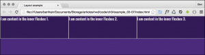
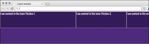
Right, so to test the theory, let’s amend the HTML classes in the markup. We’re adding FlexOne, FlexTwo, and FlexThree to each item in turn:
<div class="FlexWrapper">

<div class="FlexItem FlexOne">I am content in the inner Flexbox 1.</div>

<div class="FlexItem FlexTwo">I am content in the inner Flexbox 2.</div>

<div class="FlexItem FlexThree">I am content in the inner Flexbox 3.</div>

</div>
Now, let’s remove the previous styles related to FlexItem and instead add this:
.FlexItem {

border: 1px solid #ebebeb;

background-color: #34005b;

display: flex;

height: 100px;

}

.FlexOne {

flex: 1.5 0 auto;

}

.FlexTwo,

.FlexThree {

flex: 1 0 auto;

}
In this instance, FlexOne takes up 1.5 times the amount of space that FlexTwo and FlexThree take up.
This shorthand syntax really becomes useful for quickly bashing out relationships between items. For example, if a request comes in, such as “that needs to be 1.8 times wider than the others,” you could easily facilitate that request with the flex property.
Hopefully, the incredibly powerful flex property is starting to make a little sense now.
I could write chapters and chapters on Flexbox! There are so many examples we could look at. However, before we move on to the other main topic of this chapter (responsive images), there are just two more things I would like to share with you.
Simple sticky footer
Suppose you want a footer to sit at the bottom of the viewport when there is not enough content to push it there. This has always been a pain to achieve, but with Flexbox it’s simple. Consider this markup:
<body>

<div class="MainContent">
Here is a bunch of text up at the top. But there isn’t enough content to
push the footer to the bottom of the page.
</div>

<div class="Footer">

However, thanks to flexbox, I've been put in my place.

</div>

</body>

And here's the CSS:

html,

body {

margin: 0;

padding: 0;

}

html {

height: 100%;

}

body {

font-family: 'Oswald', sans-serif;

color: #ebebeb;

display: flex;

flex-direction: column;

min-height: 100%;

}

.MainContent {

flex: 1 0 auto;

color: #333;

padding: 0.5rem;

}

.Footer {

background-color: violet;

padding: 0.5rem;

}
Take a look at that in the browser and test by adding more content into MainContent div. You’ll see that when there is not enough content, the footer is stuck to the bottom of the viewport. When there is enough, it sits below the content.
This works because our flex property is set to grow where space is available. As our body is a flex container of 100% minimum height, the main content can grow into all of that available space. Beautiful!
Changing the source order
Flexbox has visual source reordering built-in. Let’s have a look at how it works.
Consider this markup:
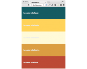
<div class="FlexWrapper">

<div class="FlexItem FlexHeader">I am content in the Header.</div>

<div class="FlexItem FlexSideOne">I am content in the SideOne.</div>

<div class="FlexItem FlexContent">I am content in the Content.</div>

<div class="FlexItem FlexSideTwo">I am content in the SideTwo.</div>

<div class="FlexItem FlexFooter">I am content in the Footer.</div>

</div>
You can see here that the third item within the wrapper has an HTML class of FlexContent—imagine that this div is going to hold the main content for the page.
OK, let’s keep things simple. We will add some simple colors to more easily differentiate the sections, and just get these items one under another in the same order they appear in the markup:
.FlexWrapper {

background-color: indigo;

display: flex;

flex-direction: column;

}

.FlexItem {

display: flex;

align-items: center;

min-height: 6.25rem;

padding: 1rem;

}

.FlexHeader {

background-color: #105b63;

}

.FlexContent {

background-color: #fffad5;

}

.FlexSideOne {

background-color: #ffd34e;

}

.FlexSideTwo {

background-color: #db9e36;

}

.FlexFooter {

background-color: #bd4932;

}
That renders in the browser like this:
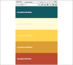
Now, suppose we want to switch the order of FlexContent to be the first item, without touching the markup. With Flexbox, it’s as simple as adding a single property/value pair:
.FlexContent {

background-color: #fffad5;

order: -1;

}
The order property lets us revise the order of items within a Flexbox simply and sanely. In this example, a value of -1 means that we want it to be before all the others.
If you want to switch items around quite a bit, I’d recommend being a little more declarative and add an order number for each item. This makes things a little easier to understand when you combine them with media queries.
Let’s combine our new source order changing powers with some media queries to produce not just a different layout at different sizes but different ordering.
Let’s suppose we want our main content at the beginning of a document. In this example, our markup looks like this:
<div class="FlexWrapper">

<div class="FlexItem FlexContent">I am content in the Content.</div>

<div class="FlexItem FlexSideOne">I am content in the SideOne.</div>

<div class="FlexItem FlexSideTwo">I am content in the SideTwo.</div>

<div class="FlexItem FlexHeader">I am content in the Header.</div>

<div class="FlexItem FlexFooter">I am content in the Footer.</div>

</div>
First is the page content, then our two sidebar areas, then the header, and finally the footer. As I’ll be using Flexbox, we can structure the HTML in the order that makes sense for the document, regardless of how things need to be laid out visually.
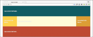
After some basic styling for each FlexItem, for the smallest screens (outside of any media query), I’ll go with the following order:
.FlexHeader {

background-color: #105b63;

order: 1;

}

.FlexContent {

background-color: #fffad5;

order: 2;

}

.FlexSideOne {

background-color: #ffd34e;

order: 3;

}

.FlexSideTwo {

background-color: #db9e36;

order: 4;

}

.FlexFooter {

background-color: #bd4932;

order: 5;

}
That gives us this in the browser:
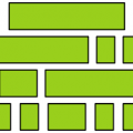
And then, at a breakpoint, I’m switching to this:
@media (min-width: 30rem) {

.FlexWrapper {

flex-flow: row wrap;

}

.FlexHeader {

width: 100%;

}

.FlexContent {

flex: 1 0 auto;

order: 3;

}

.FlexSideOne {

width: 150px;

order: 2;

}

.FlexSideTwo {

width: 150px;

order: 4;

}

.FlexFooter {

width: 100%;

}

}
That gives us this in the browser:
In that example, the shortcut flex-flow: row wrap has been used. flex-flow is actually a shorthand property of sorts that lets you set two properties in one: flex-direction and flex-wrap.
We’ve used flex-direction already to switch between rows and columns and to reverse elements. However, we haven’t looked at flex-wrap yet.
