
- July 15, 2021
- Posted by: team SOUTECH
- Category: Blog, Responsive Web Design, Web Development Training, Website Design Service Abuja, Website Design Training
Named grid lines
Grid allows authors to work with grids in a number of ways. For example, if you’d rather work with words than numbers, it’s possible to name grid lines. Consider a 3-column by 3-row grid.
Here’s our markup:
<div class="my-first-grid">

  <div class="grid-item-1">1</div>

  <div class="grid-item-2">2</div>

  <div class="grid-item-3">3</div>

  <div class="grid-item-4">4</div>

  <div class="grid-item-5">5</div>

  <div class="grid-item-6">6</div>

  <div class="grid-item-7">7</div>

  <div class="grid-item-8">8</div>

  <div class="grid-item-9">9</div>

</div>
We set the grid up with this rule. Note the words in square brackets:
.my-first-grid {

  display: inline-grid;

  grid-gap: 10px;

  grid-template-columns: [left-start] 200px [left-end center-start] 200px [center-end right-start] 200px [right-end];

  grid-template-rows: 200px 200px 200px;

  background-color: #e4e4e4;

}
What we are doing inside the square brackets is giving a name to the grid line. In this instance, the first column grid line we have named left-start, and the one after the first column we have named left-end. Notice that, in the center grid line, we have assigned two names: left-end and center-start. We can do this by space-separating the names. In this situation, it makes sense because that grid line is both the end of the left column and the beginning of the center one.
Let’s amend our grid-template-row and add some named grid lines there too:
grid-template-rows: [top-start] 200px [top-end middle-start] 200px [middle-end bottom-start] 200px [bottom-end];
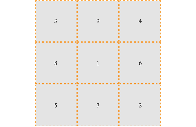
Here’s an example of how we can use these names to position grid items instead of numerical values. This is just the first three of the items we will see in the following diagram:
.grid-item-1 {

  grid-column: center-start / center-end;

  grid-row: middle-start / middle-end;

}

.grid-item-2 {

  grid-column: right-start / right-end;

  grid-row: bottom-start / bottom-end;

}

.grid-item-3 {

  grid-column: left-start / left-end;

  grid-row: top-start / middle-start;

}
In the example code, I have set each grid item to a random position using this technique. You can see how the three above are placed in this diagram:
In specification terms, the names we assign to grid lines are known as a “custom ident.” Because they are just words, avoid using terminology that might interfere with grid keywords. For example, don’t start naming grid lines “dense,” “auto-fit,” or “span,” for example!
Grid has an extra nicety you can make use of when you use named grid lines. If you append your names with “-start” and “-end,” as we have in our example, then grid automagically (yes, I know, that’s not a real word) makes you a named grid area. Wait, what? Yep, that means that once you have named your grid lines, you can place items in your grid with a one-line grid-area. To prove that point, here are just the first three grid-item rules from earlier rewritten this way:
.grid-item-1 {

  grid-area: middle / center;

}

.grid-item-2 {

  grid-area: bottom / right;

}

.grid-item-3 {

  grid-area: top / left;

}
I’ve gotten a little bit ahead of myself now, as I have introduced grid-area without any explanation. Let’s cover that now.
grid-template-areas
Yet another way you can work with Grid is to create grid template areas to establish the areas of your grid. Let’s rework our prior example and we will remove the named grid lines entirely, starting again with this basic CSS for the grid.
.my-first-grid {

  display: inline-grid;

  grid-gap: 10px;

  grid-template-columns: 200px 200px 200px;

  grid-template-rows: 200px 200px 200px;

  background-color: #e4e4e4;

}

[class^='grid-item'] {

  display: grid;

  align-items: center;

  justify-content: center;

  outline: 3px dashed #f90;

  font-size: 30px;

  color: #333;

}
Now, we will define our grid template areas like this, which we will add to the .my-first-grid rule:
grid-template-areas:

  'one two three'

  'four five six'

  'seven eight nine';
With grid-template-areas, we can define rows and columns very simply. A row is defined with quotes (double or single), with the names of each column space-separated inside. Each row in the grid is just another pair of quotes with custom idents inside.
You can use numbers for the start of each grid area but you then need to “escape” them when you reference them. For example, if one of our areas was named “9,” it would have to be referenced like this: grid-area: “\39;”. I find that too burdensome, so I suggest using a string for each area or, at least, starting each custom ident with an alpha character.
And that means we can position our items with grid-area like this:
.grid-item-1 {

grid-area: five;

}

.grid-item-2 {

grid-area: nine;

}

.grid-item-3 {

grid-area: one;

}
Admittedly, this is a simplistic example, but hopefully, you can imagine a more useful scenario: perhaps a blog layout with a header, left-hand sidebar area, main content area, and footer. You might define the necessary grid-template-areas like this:
grid-template-areas:
‘header header header header header header’
‘side side main main main main’
‘side side footer footer footer footer’;
As the specification (the link for the relevant section follows) states that any whitespace character fails to produce a token, you could opt to separate columns with tab characters if you would rather, to aid visually lining up the columns:
https://www.w3.org/TR/css-grid-1/#valdef-grid-template-areas-string.
When you write the grid template areas, the indentation is not important, nor are the carriage returns; you could lay each row out in a long space-separated list if you liked. As long as the names for each area are inside quotes, with a whitespace character between each, and there is a space between each set of quotes, all is well.
Applying what you have learned so far
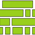
As an exercise, consider this section of the https://rwd.education website:
Can you use your grid knowledge to lay out this section?
If you look in the Start folder for this chapter’s code, you will see that, currently, those sections are just one under the other. Try to amend the code for that section with Grid. Perhaps think about how you could easily have it showing one or two of those sections when screen space is limited, and the layout that is shown in the preceding screenshot when space allows.
There’s already a working draft for CSS Grid Layout Module Level 2. The principle benefit it brings with it is the ability to have subgrids: grids within grids that can inherit the track sizing of their parents. You can read the current specification here: https://www.w3.org/TR/css-grid-2/.
Let’s move on to some even more advanced Grid techniques now.
auto-fit and auto-fill
auto-fit and auto-fill are “repeat-to-fill” keywords used to describe repetition to Grid.
Thanks to the similarity of their names, I can’t help but feel that the auto-fit and auto-fill keywords are almost guaranteed to confuse—just like cover and contain do for background-image sizing (we cover them in Stunning Aesthetics with CSS).
The upshot of this is that I frequently have to check which one is which. Thankfully, for both our benefits, we’re going to clarify what each of these does now, and why you might want to use them.
Let me start with the why, as that covers both keywords. What if I told you that with the help of auto-fill or auto-fit, we can create a fully responsive grid that adds/removes columns based upon the available size of the viewport, with no media queries needed?
Compelling, right?
Consider a 9-column grid, where each column is at least 300px wide. In a slightly back-to-front way, I want to start this by showing you the solution:
grid-template-columns: repeat(auto-fit, minmax(300px, 1fr));
And here is what that gives you in the browser in a smaller viewport:
And the same thing on a wider screen:
Pretty handy, right?
Let’s break down all the magic in that one-liner.
We are using grid-template-columns, as we have done before, to set up the columns of our grid. We are using the repeat() function to set up a repeating pattern of columns; however, instead of passing in a number of columns, we tell the grid to auto-fit. We may have used auto-fill there too, but we’ll get to the differences between them in a moment. For now, we have told the browser to repeatedly create auto-fit columns, and we define the width of those columns using the minmax function.
The minmax() function
Now, if you are new to Grid, it’s likely you haven’t used minmax() before. It’s a CSS function that allows you to set up a range for the browser. You specify a minimum size and a maximum size, and it computes something in between based on the available space. In our example, we are passing minmax() a minimum size of 300px and a maximum size of one fr (remember, it might help to think of fr as “free room”).
When dealing with minmax(), if you specify a maximum size that is smaller than the minimum, the maximum will be ignored and the minimum will be the computed value.
With that set, the grid “auto-fits” columns that are at least 300px wide and no more than the size of its content plus a 1fr share of any remaining space.
In practical terms, this provides a responsive layout that lets our grid resize itself based on the available viewport width.
To more easily show you the difference between auto-fit and auto-fill, let’s revise our one-liner to a minimum of 100px:
grid-template-columns: repeat(auto-fit, minmax(100px, 1fr));
That gives us this layout on a wide viewport:
Note how the columns span the entire width of the page. Now we will change to auto-fill:
grid-template-columns: repeat(auto-fill, minmax(100px, 1fr));
Notice the space at the end? What happened there?
The key to understanding the difference comes down to whether spare columns are collapsed or not.
When the browser creates the grid in both auto-fit and auto-fill, it initially lays them out the same. However, when using auto-fit, any extra columns left, having laid out the content, are collapsed, leaving that space free to be distributed evenly between the items in the row. In our example, because each item also has a maximum size of 1fr unit, each k[takes up an equal portion of that free space. This results in columns that span the entire width of the space.
However, with auto-fill, once the items (in our example, 100px wide) are laid out, if there is any extra space, the extra empty columns are not collapsed. They remain in situ, filled up, and subsequently the space is not free for the grid items to gobble up. The result is that we get space at the end.
There will be instances where one is more appropriate than the other; just be aware that you can achieve either.
You can see, in some of the screenshots, indicators for where the grid lines are. These are grabs from the Firefox Grid tool, which is part of its developer tools. As I write this, in early 2020, I think Firefox has, by far, the best developer tools for dealing with Grid.
Shorthand syntax
There are a couple of shorthand syntaxes you can use with Grid: one relatively straightforward, one less so. The first one that you’ll probably find most utility for is grid-template.
While shorthand syntaxes can be great, my advice would be to write your grids one property at a time, at least to begin with. When you get confident enough that writing each property and value out individually becomes a chore, take the time to learn the shorthand variant.
With that advice dispensed, let’s look at these two shorthand methods.
grid-template shorthand
This allows you to set grid-template-rows, grid-template-columns, and grid-template-areas in one line.
So, for example, for a grid with two 200px rows and three 300px columns, we could write:
grid-template: 200px 200px / 300px 300px 300px;
Or, if you’d rather do it with the repeat function, you could write:
grid-template: repeat(2, 200px) / repeat(3, 300px);
The part before the forward slash deals with the rows and the bit after the columns. You can add grid-template-areas in there too if you like:
grid-template:
[rows-top] 'a a a' 200px

'b b b' 200px [rows-bottom]

/ 300px 300px 300px;
That computes to this in the browser:
[/html]
grid-template-rows: [rows-top] 200px 200px [rows-bottom];
grid-template-columns: 300px 300px 300px;
grid-template-areas: ‘a a a’ ‘b b b’;
Personally, I find that once you start throwing template areas into the values, it starts getting a bit too much to reason about. Regardless, some people love the shorthand and you should be aware it's possible.

However, we're going to take it up another notch now and deal with the grid shorthand.


grid shorthand

The other shorthand syntax, grid, lets you define a grid all in one line.

Using this one property, you can set the properties controlling the explicit portion of a grid: grid-template-rows, grid-template-columns, and grid-template-areas, as well as the properties controlling the implicit part of a grid: grid-auto-rows, grid-auto-columns, and grid-auto-flow.

An essential concept to hold onto when writing the grid shorthand is that a grid can only grow implicitly with either rows or columns, not both. At first, that might seem odd, but if you think about it, how would a grid that could add both rows and columns implicitly lay items out? How would it decide whether to add rows or columns?

So, with that in mind, we can endeavor to wrap our heads around the grid shorthand.

The grid shorthand is not for the faint-hearted, so don't be discouraged if it spits you back out a few times before you get to grips with it. I consider myself pretty familiar with CSS (I know, you'd hope so, right?), but it took me hours rather than minutes to feel confident with what the grid shorthand syntax was doing.

I hope you know your Backus-Naur form, because here is how the property is described in the specification:


<'grid-template-rows'> / [ auto-flow && dense? ] <'grid-auto-columns'>? [ auto-flow && dense? ] <'grid-auto-rows'>? / <'grid-template-columns'>
Simple, right?
I kid, of course. At this point, when trying to understand a specification, I tend to search out this piece on understanding CSS specifications: https://www.smashingmagazine.com/2016/05/understanding-the-css-property-value-syntax/.
After rereading that, I’ll now do my best to distill that piece of the specification into something more human friendly. What that means is, the grid shorthand can accept any one of three different sets of syntax as its value.
grid shorthand value – option one
This is the same value that you would use if you were using grid-template. For example, here is a grid with two 100px rows and three 200px columns:
grid: 100px 100px / 200px 200px 200px;
Just like with our grid-template examples from earlier, you can also use grid-template-areas if you like.
grid shorthand value – option two
A set of lengths for explicit grid rows, then, separated by the slash, a definition for how you want to handle implicit columns. This can be auto-flow to set grid-auto-rows, with the option of setting grid-auto-flow by adding dense too. Or, alternatively, you could add a length value for the width of the columns if you want to set grid-template-columns instead.
Phew, that’s a lot to compute. Take a look at some examples.
So, for a grid with two explicit 100px rows and any number of explicit columns that are 75px wide:
grid: 100px 100px / repeat(auto-fill, 75px);
With this grid, should you have too many items, they will spill over into the implicit rows with a default size of auto.
In the browser, that shorthand will compute to the following:
grid-template-rows: 100px 100px;
grid-template-columns: repeat(auto-fill, 75px);
grid-template-areas: none;
grid-auto-flow: initial;
grid-auto-rows: initial;
grid-auto-columns: initial;
Let’s try another. Say we want to lay out a grid that has only one row, 100px high, but any number of columns, potentially running off the side of the container:
grid: 100px / auto-flow;
That rule computes to the following:
grid-template-rows: 100px;
grid-template-columns: initial;
grid-template-areas: initial;
grid-auto-flow: column;
grid-auto-rows: initial;
grid-auto-columns: initial;
It’s also worth knowing that, when you use the grid shorthand, you are resetting all of the values it deals with back to their initial state. You can see that if you look at the computed values of styles in the developer tools of your browser.
grid shorthand value – option three
The final syntax you can pass to grid is effectively the opposite of option two. This time, you set grid-auto-flow to handle implicit rows (with an optional dense) with an optional grid-auto-rows value for the size of the rows. Then, after the slash, we handle grid-template-columns.
With this kind of value, we are getting our grid to lay out in rows when needed, rather than in columns, as in the previous option. Here are some examples.
How about a grid that creates as many 100px rows as needed and 5 columns that occupy 1fr each?
grid: auto-flow 100px / repeat(5, 1fr);
That computes to this:
grid-template-rows: initial;
grid-template-columns: repeat(5, 1fr);
grid-template-areas: initial;
grid-auto-flow: row;
grid-auto-rows: 100px;
grid-auto-columns: initial;
Or, what about a grid that creates a single column with as many 100px rows as needed for the content?
grid: auto-flow 100px / auto;
That computes to this:
grid-template-rows: initial;
grid-template-columns: auto;
grid-template-areas: initial;
grid-auto-flow: row;
grid-auto-rows: 100px;
grid-auto-columns: initial;
You can see that the grid shorthand is very powerful but, arguably, not particularly intuitive. For some people, the shorthand is preferable. For some, it is maddening. There is no right or wrong—just what is right or wrong for you.