
- July 2, 2021
- Posted by: team SOUTECH
- Category: Responsive Web Design
Explicit and implicit
Earlier in the chapter, we discussed the difference between an explicit and implicit grid; an explicit grid being the structure you define in your CSS when setting up the grid. When more content is placed in that grid than you provisioned for, the “implicit” grid comes into effect.
Let’s look at that again by extending our prior example.
Let’s add in another item and see what happens:
<div class="my-first-grid">

<div class="grid-item-1">1</div>

<div class="grid-item-2">2</div>

<div class="grid-item-3">3</div>

<div class="grid-item-4">4</div>

<div class="grid-item-5">5</div>

</div>
With that added, this is what we get in the browser:
That’s sort of useful; the grid has created implicit grid lines to create an implicit track for our new item. Now, we didn’t tell it what to do with that extra item, so it made the best guess. However, we can control how Grid handles items implicitly with the following properties: grid-auto-rows and grid-auto-columns.
grid-auto-rows and grid-auto-columns
Let’s use grid-auto-rows and grid-auto-columns to make any extra grid items the same size as the existing ones:
.my-first-grid {k

display: inline-grid;

grid-gap: 10px;

grid-template-rows: 200px 200px;

grid-template-columns: 200px 200px;

grid-auto-rows: 200px;

grid-auto-columns: 200px;

background-color: #e4e4e4;

}
Now, without writing any extra CSS, when additional items are placed in our grid, they get the 200px × 200px sizing we have defined. Here we have added another item in the DOM for a total of six:
You can even make patterns so that the first extra item is one size and the next is another. The pattern gets repeated:
.my-first-grid {

display: inline-grid;

grid-gap: 10px;

grid-template-rows: 200px 200px;

grid-template-columns: 200px 200px;

grid-auto-rows: 100px 150px;

grid-auto-columns: 100px 150px;

background-color: #e4e4e4;

}
Can you see how item 5 onwards uses the pattern we defined in the value of the grid-auto-rows property? First, it is 100px tall, then 150px, and then back to 100px.
So far, you can see that the grid items are flowing vertically down the page. You can easily switch this to flow across the page instead!
grid-auto-flow
The grid-auto-flow property allows you to define the direction that any implicitly added items flow inside the grid. Use a value of column when you want the grid to add extra columns to accommodate extra items, and use a value of row when you want the grid to add extra rows.
Let’s amend our example by adding grid-auto-flow: column to make the items flow across the page instead of down:k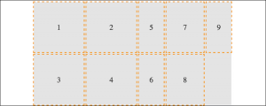
There is an additional dense keyword that can be added to grid-auto-flow: column dense or grid-auto-flow: row dense – we’ll look at that shortly.
Placing and sizing grid items
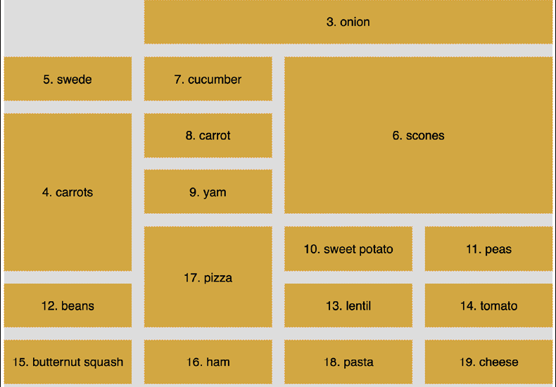
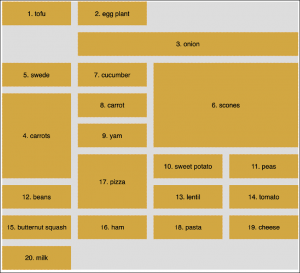
So far, each item we have added to a grid has taken up a single grid area. We are going to start a new example now . This grid will have 20 grid items; these are just random food items and their source order within their container as a number. However, there are quite a few new things to go over in the CSS. Before we go through each new thing step by step, take a look at the code and the screenshot and see how much of it you can make sense of before reading on.
It’s also worth mentioning that I’ve purposely mixed up the use of whitespace in the values. You can write grid-row: 6 / span 2 or grid-row: 6/span 2—either is just as valid. Just pick which you prefer.
Here’s the markup:
<div class="container">

<div class="grid-item1">1. tofu</div>

<div class="grid-item2">2. egg plant</div>

<div class="grid-item3">3. onion</div>

<div class="grid-item4">4. carrots</div>

<div class="grid-item5">5. swede</div>

<div class="grid-item6">6. scones</div>

<div class="grid-item7">7. cucumber</div>

<div class="grid-item8">8. carrot</div>

<div class="grid-item9">9. yam</div>

<div class="grid-item10">10. sweet potato</div>

<div class="grid-item11">11. peas</div>

<div class="grid-item12">12. beans</div>

<div class="grid-item13">13. lentil</div>

<div class="grid-item14">14. tomato</div>

<div class="grid-item15">15. butternut squash</div>

<div class="grid-item16">16. ham</div>

<div class="grid-item17">17. pizza</div>

<div class="grid-item18">18. pasta</div>

<div class="grid-item19">19. cheese</div>

<div class="grid-item20">20. milk</div>

</div>
Here is the CSS:
.container {

font-size: 28px;

font-family: sans-serif;

display: grid;

gap: 30px;

background-color: #ddd;

grid-template-columns: repeat(4, 1fr);

grid-auto-rows: 100px;

grid-auto-flow: row;

}

[class^='grid-item'] {

outline: 1px #f90 dashed;

display: grid;

background-color: goldenrod;

align-items: center;

justify-content: center;

}

.grid-item3 {

grid-column: 2/-1;

}

.grid-item6 {

grid-row: 3/6;

grid-column: 3 / 5;

}

.grid-item17 {

grid-row: 6 / span 2;

grid-column: 2/3;

}

.grid-item4 {

grid-row: 4 / 7;

}
And here is what we get in the browser:
We’ve introduced a few new things here. Let’s cover each in turn.
gap
I’ve used gap in some of the prior code samples, but I’ve not explained it. Forgive me! The gap property lets you specify a gap between grid tracks. It is actually shorthand for both row-gap and column-gap. Just like when you specify a margin with two values, the first value applies to the top and bottom (row), and the second to the left and right (columns). If you specify a single value, as we have, it applies to both.
You might see grid-gap used instead of gap. That’s because, initially, the property was called grid-gap before being revised, and plenty of browsers only supported grid-gap initially. If you want the widest browser support, you can safely use grid-gap instead.
repeat
If you were making a grid with 30 identical columns, it would get a little tiring having to write auto 30 times, for instance, grid-template-columns: auto auto auto auto auto auto…; in fact, I got bored just writing that!
Thankfully, the grid specification writers have blessed us with repeat(). As you might have guessed, the repeat() function provides a convenient way of stamping out the needs of any number of items. In our example, we have used it to create four columns, all 1fr in width:
repeat(4, 1fr);
The format of the syntax is that, inside the parentheses, the first value is the number of times you want something repeated, and the second value is the width of each item.
Don’t worry, I’ll explain fr units in a moment; for now, just know that you can create multiple columns/rows with ease. Do you want 15 columns, all 100px wide? It’s as easy as repeat(15, 100px).
fr units
The fr unit represents “flexible length” and stands for “flex fraction.” It’s used to communicate how much of any available free space we want something to gobble up, much like the flex-grow unit we covered for Flexbox in Fluid Layout, Flexbox, and Responsive Images.
The specification doesn’t say so, but I conceptualize fr as standing for “free room” when I’m thinking about a layout. In our example, we have made four columns, each taking up one portion of the available free room.
Placing items in the grid
Before this example, we have been positioning each grid item in a single grid area. However, here, we have certain grid items being assigned spans of columns or rows numerically.
Let’s take the grid-item3 example:
.grid-item3 {

grid-column: 2/-1;

}
Here, the grid-column property is being set to start at the second grid line and end at the -1 grid line. The -1 looks pretty odd at first, but it is part of a very smart piece of syntax.
The first number is the start point, which is separated from the endpoint with a forward slash. Positive numbers count from the start side—the left-hand side in our column example, while negative numbers start from the end side—the right, in this instance. So, -1 basically just means the last grid line. So, this nice terse syntax just reads: “Start at line 2 and go to the end.”
I’ve purposely left some of the other examples with messy whitespace around the numbers to show that you can keep the space or omit it—no drama either way.
There’s an example of spanning across rows in there too. Take a look at this one again:
.grid-item4 {

grid-row: 4 / 7;

}
This one says, “Start at grid row line 4 and end at grid row line 7.”
span
Take a look at the CSS for .grid-item17 now:
.grid-item17 {

grid-row: 6 / span 2;

grid-column: 2/3;

}
Can you see how we have done something a little different with the value for grid-row?
Rather than stipulating a definite start and end point when placing grid items, you can give one or the other and then tell the item to span a number of rows/columns from that point either forward or backward. In our example, we told the item to start at grid line 6 and span 2 rows.
I find going backward a little more confusing, but that might just be me! But to illustrate, we could achieve the same visual effect for our example by changing that line to grid-row: span 2 / 8. In this instance, the definite point we have is the endpoint, so we are telling the grid to make the item start at grid row 8 and span 2 back from there.
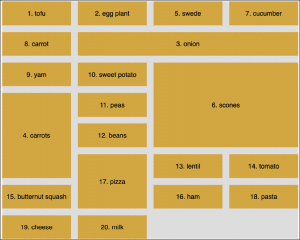
dense
Remember when we looked at grid-auto-flow, I mentioned the dense keyword? Well, this is the perfect opportunity to show you what that does. I’ll amend the value of the grid-auto-flow property to this: grid-auto-flow: row dense;. And here is what it does in the browser:
Can you see how the gaps have been filled? That’s what dense does for you. However, while this might seem more aesthetically pleasing, there is a cost. The reason the items are numbered is that I wanted to highlight to you that using dense tells the grid algorithm to move things, visually, from their source order to any available space.
Named grid lines
Grid allows authors to work with grids in a number of ways. For example, if you’d rather work with words than numbers, it’s possible to name grid lines. Consider a 3-column by 3-row grid.