
- July 16, 2021
- Posted by: team SOUTECH
- Category: Blog, Blogging, Professional Website Design Free Training, Responsive Web Design, Website Design Service Abuja, Website Design Training
CSS gives us more power to select elements based upon where they sit in the structure of the DOM. Let’s consider a common design treatment; we’re working on the navigation bar for a larger viewport and we want to have all but the last link over on the left. Historically, we would have needed to solve this problem by adding a class name to the last link so we could select it, like this:
<nav class="nav-Wrapper">
  <a href="/home" class="nav-Link">Home</a>
  <a href="/About" class="nav-Link">About</a>
  <a href="/Films" class="nav-Link">Films</a>
  <a href="/Forum" class="nav-Link">Forum</a>
  <a href="/Contact-Us" class="nav-Link nav-LinkLast">Contact Us</a>
</nav>
This in itself can be problematic. For example, sometimes, just getting a content management system to add a class to a final list item can be frustratingly difficult. Thankfully, in those eventualities, it’s no longer a concern. We can solve this problem and many more with CSS structural pseudo-classes.
The :last-child selector
CSS 2.1 already had a selector applicable for the first item in a list; the :first-child selector:
div:first-child {
/* Styles */
}
However, CSS Level 3 added a selector that can also match the last:
div:last-child {
/* Styles */
}
Let’s look how that selector could fix our prior problem if we didn’t want to, or couldn’t add, another class at the desired point in the markup:
.nav-Wrapper {
display: flex;
}
.nav-Link:last-child {
margin-left: auto;
}
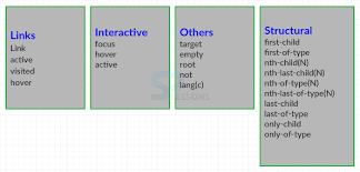
There are also useful selectors for when something is the only item: :only-child and the only item of a type: :only-of-type.
The nth-child selectors
The nth-child selectors let us solve even more difficult problems. With the same markup as before, let’s consider how nth-child selectors allow us to select any arbitrary link(s) we want within the list.
Firstly, what about selecting every other list item? We could select the odd ones like this:
.nav-Link:nth-child(odd) {
/* Styles */
}
Or, if you wanted to select the even ones, you could do this:
.nav-Link:nth-child(even) {
/* Styles */
}
Understanding what nth rules do
For the uninitiated, nth-based selectors can look pretty intimidating. However, once you’ve mastered the logic and syntax, you’ll be amazed what you can do with them. Let’s take a look.
Here are the nth-based selectors at our disposal:
• nth-child(n)
• nth-last-child(n)
• nth-of-type(n)
• nth-last-of-type(n)
We’ve seen that we can use (odd) or (even) values already in an nth-based expression, but the (n) parameter can be used in another couple of ways:
• As an integer; for example, :nth-child(2) would select the second item. Passing a number/integer into the nth selector is easy enough to understand; just enter the element number you want to select.
• However, you can also pass a numeric expression. For example, :nth-child(3n+1) would start at the first element, and then select every third element.
The numeric expression version of the selector is the part that can be a little baffling at first. Let’s break it down.
Breaking down the math
Let’s consider 10 spans on a page
<span></span>
<span></span>
<span></span>
<span></span>
<span></span>
<span></span>
<span></span>
<span></span>
<span></span>
<span></span>
We will style them like this:
span {
height: 2rem;
width: 2rem;
background-color: blue;
display: inline-block;
}
As you might imagine, this gives us 10 squares in a line
OK, let’s look at how we can select different ones with nth-based selections.
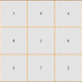
For practicality, when considering the expression within the parentheses, I start from the right. So, for example, if I want to figure out what (2n+3) will select, I start with the right-most number (the “3” here indicates the third item from the left) and know it will select every second element from that point on. So, adding this rule:
span:nth-child(2n + 3) {
background-color: #f90;
border-radius: 50%;
}
Results differently in the browser.
As you can see, our nth selector targets the third list item and then every subsequent second one after that too. If there were 100 list items, it would continue selecting every second one.
How about selecting everything from the second item onwards? Well, although you could write :nth-child(1n+2), you don’t actually need the first number 1 as, unless otherwise stated, n is equal to 1. We can, therefore, just write :nth-child(n+2). Likewise, if we wanted to select every third element, rather than write :nth-child(3n+3), we could just write :nth-child(3n) as every third item would begin at the third item anyway, without needing to state it explicitly.
The expression can also use negative numbers; for example, :nth-child(3n-2) starts at minus 2 and then selects every third item.
You can also change the direction. By default, once the first part of the selection is found, the subsequent ones go down the elements in the DOM (and therefore from left to right in our example). However, you can reverse that with a minus; for example:
span:nth-child(-2n+3) {
background-color: #f90;
border-radius: 50%;
}
This example finds the third item again, but then goes in the opposite direction to select every two elements (up the DOM tree and therefore from right to left in our example)
Hopefully, the nth-based expressions are making more sense now. nth-child and nth-last-child differ in that the nth-last-child variant works from the opposite end of the document tree. For example, :nth-last-child(-n+3) starts at 3 from the end and then selects all the items after it.
Finally, let’s consider :nth-of-type and :nth-last-of-type. While the previous examples count any children, regardless of type (always remember the nth-child selector targets all children at the same DOM level, regardless of classes), :nth-of-type and :nth-last-of-type let you be specific about the type of item you want to select. Consider the following markup, which is a mixture of div and span elements, albeit with the same class:
<span class="span-class"></span>
<span class="span-class"></span>
<span class="span-class"></span>
<span class="span-class"></span>
<span class="span-class"></span>
<div class="span-class"></div>
<div class="span-class"></div>
<div class="span-class"></div>
<div class="span-class"></div>
<div class="span-class"></div>


If we used the selector:


.span-class:nth-of-type(-2n+3) {
background-color: #f90;
border-radius: 50%;
}
Even though all the elements have the same span-class class, they don’t get seen as one group. The selector applies once to the span elements, and then to the div elements.
CSS doesn’t count like JavaScript and jQuery! If you’re used to using JavaScript and jQuery, you’ll know that it counts from 0 upward (zero index-based). For example, if selecting an element in JavaScript or jQuery, an integer value of 1 would actually be the second element. CSS, however, starts at 1 so that a value of 1 is the first item it matches.
nth-based selection in responsive web designs
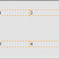
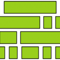
Just to close out this little section, I want to illustrate a real-life responsive web design problem and how we can use nth-based selection to solve it. Imagine we are building a page where we want to list the top grossing movies from a given year. Our content management system simply spits all the items out in a list, but we want to show them in a grid of sorts.
For some viewports, we will only be able to fit two items wide. However, as the viewport increases in width, we can show three items and at larger sizes still, we can show four. Here is the problem, though. Regardless of the viewport size, we want to prevent any items on the bottom row from having a border on the bottom.
See that pesky border below the bottom two items? That’s what we need to remove. However, I want a robust solution so that if there was another item on the bottom row (we want to go one better than other sites and show the top 11 top grossing films!), the border would also be removed from that too.
Now, because there are a different number of items on each row at different viewports, we will also need to change the nth-based selection at different viewport widths. But we can use media queries for that. For the sake of brevity, I’m not going to show you the selection for each media query. I’ll just show you the selection that matches four items per row, as you can see in the preceding screenshot. However, you can open the code sample to see the selections for each different viewport:
@media (min-width: 55rem) {
.Item {
width: 25%;
}
/* Get me every fourth item and of those, only ones that are in the last four items */
.Item:nth-child(4n+1):nth-last-child(-n+4),
/* Now get me every one after that same collection too. */
.Item:nth-child(4n+1):nth-last-child(-n+4) ~ .Item {
border-bottom: 0;
}
}
You’ll notice here that we are chaining the nth-based pseudo-class selectors, much like we chained attribute selectors earlier in this chapter. It’s important to understand when you chain nth selectors like this that the first selector doesn’t “filter” the selection for the next selector; rather, the element has to match each of the selections.
So, for the line like this:
.Item:nth-child(4n+1):nth-last-child(-n+4),
.Item has to be the first item of four and also be one of the last four
Nice! Thanks to nth-based selections, we have a defensive set of rules to remove the bottom border, regardless of the viewport size or number of items we are showing.
Now, one nifty bit of selection we are doing in that prior example is using the “subsequent sibling” selector. We haven’t looked at that, so we will cover that next.
Combinator selectors – child, next sibling, and subsequent sibling
I’m making the assumption at this point that you understand the basic selector pattern where one class followed by another selects any descendant that matches. For example, .parent .descendant {} would select any element that was a descendant of the .parent element with a class of .descendant, no matter how many levels deep.
The child combinator
The child combinator only selects direct descendants. Consider this markup:
<div class="parent">

  <div class="descendant child">

    <div class="descendant grandchild"></div>

  </div>

</div>
We can select only the direct “child” of the parent element, like this:
.parent > .descendant {

  /* Styles */

}
Notice the right angle bracket between the two class names in the selector; that’s the child combinator symbol.
The next sibling
Consider another example:
<div class="item one">one</div>

<div class="item">two</div>

<div class="item">three</div>

<div class="item">four</div>

<div class="item">five</div>

<div class="item">six</div>
Let’s suppose we wanted to select an item, but only if it is the next sibling of .one. With that markup, we could select the two elements like this:
.one + .item {

  border: 3px dashed #f90;

}
The + symbol there means “next sibling,” so select the next sibling element of .one.
The subsequent sibling
With the same markup from the previous example, if we wanted to select all items after the third, we could do this:
.item:nth-child(3) ~ .item {

  border: 3px dashed #f90;

}
The ~ symbol, called “tilde,” says “every subsequent sibling.”
The negation (:not) selector
Another handy selector is the negation pseudo-class selector. This is used to select everything that isn’t something else. Consider this:
<div class="a-div"></div>

<div class="a-div"></div>

<div class="a-div"></div>

<div class="a-div not-me"></div>

<div class="a-div"></div>
And then these styles:
div {

  display: inline-block;

  height: 2rem;

  width: 2rem;

  background-color: blue;

}

.a-div:not(.not-me) {

    background-color: orange;

    border-radius: 50%;

}
Our final rule will make every element with a class of .a-div orange and round, with the exception of the div that also has the .not-me class. You can find that code at https://rwd.education):
So far, we have looked primarily at what’s known as structural pseudo-classes (full information on this is available at http://www.w3.org/TR/selectors/#structural-pseudos). However, CSS has many more selectors. If you’re working on a web application, it’s worth looking at the full list of UI element states pseudo-classes (http://www.w3.org/TR/selectors/#UIstates) as they can, for example, help you target rules based on whether something is selected or not.
The empty (:empty) selector
I’ve encountered situations where I have an element that includes some padding on the inside and gets content dynamically inserted. Sometimes, it gets content inserted, while sometimes, it doesn’t. The trouble is, when it doesn’t include content, I still see the padding.
<div class=”thing”></div>
And here’s the CSS:
.thing {

  padding: 1rem;

  background-color: violet;

}
Without any content in that element, I still see the background color. Thankfully, we can easily hide it, like this:
.thing:empty {

display: none;

}
However, just be careful with the :empty selector. For example, you might think this is empty:
<div class=”thing”> </div>
It isn’t! Look at the whitespace in there. Whitespace is not “no” space! And nor would something like a line break be either.
However, just to confuse matters, be aware that a comment doesn’t affect whether an element is considered “empty” or not. For example, this is still considered empty:
<div class=”thing”><!–I’m empty, honest I am–></div>
Remember to check support for your users. As we delve into CSS more and more, don’t forget to visit http://caniuse.com, if you ever want to know what the current level of browser support is for a particular CSS or HTML5 feature. Alongside showing browser version support (searchable by feature), it also provides the most recent set of global usage statistics from http://gs.statcounter.com.
Let’s change tack now. We’ve looked at how we can select items in our responsive world. But how about how we size them? We’ll look at viewport-percentage lengths next.
Responsive viewport-percentage lengths (vmax, vmin, vh, and vw)
CSS Values and Units Module Level 3 (http://www.w3.org/TR/css3-values/#viewport-relative-lengths) ushered in viewport relative units. These are great for responsive web design, as each unit is a percentage length of the viewport:
- The vw unit, where each vw unit is 1% of the viewport width.
- The vh unit, where each vh unit is 1% of the viewport height.
- The vmin unit (for viewport minimum; equal to the smaller of either vw or vh).
- The vmax (viewport maximum; equal to the larger of either vw or vh).
Want a modal window that’s 90% of the browser height? This is as easy as:
.modal {
height: 90vh;
}
As useful as viewport relative units are, some browsers have curious implementations. Safari in iOS, for example, changes the viewable screen area as you scroll from the top of a page (it shrinks the address bar), but doesn’t make any changes to the reported viewport height.
However, you can perhaps find more utility for these units when coupled with fonts. For example, it’s now trivially easy to create text that scales in size, depending upon the viewport.
For example:
.Hero-text {

font-size: 25vw;

}
Now, the text will always be sized as a percentage of the viewport width.
There is a new mathematical expression on the way to CSS called clamp(), which lets us specify a minimum, maximum, and variable size. For example, we might opt for a headline like this: .headline { font-size: clamp(20px, 40vw, 80px) }. And while our headline text might vary in size, depending upon the viewport, it would never be less than 20px or larger than 80px. You can read the specification for clamp() here: https://www.w3.org/TR/css-values-4/#calc-notation.
Right, we’ve dealt with selectors of various types, and some of the more recent length units that are particularly relevant to responsive designs. Before we move on to web typography, let’s cover some important capabilities of CSS.
CSS calc
How many times have you been trying to code out a layout and thought something like, “it needs to be half the width of the parent element minus exactly 10px”? This is particularly useful with responsive web design, as we never know the size of the screen that will be viewing our web pages. Thankfully, CSS has a way to do this. It’s called the calc() function. Here’s that example in CSS:
</pre>
<p style="font-family: Georgia, 'Times New Roman', 'Bitstream Charter', Times, serif; white-space: normal;">.thing {</p>
<p style="font-family: Georgia, 'Times New Roman', 'Bitstream Charter', Times, serif; white-space: normal;">    width: calc(50% - 10px);</p>
<p style="font-family: Georgia, 'Times New Roman', 'Bitstream Charter', Times, serif; white-space: normal;">}</p>

<pre>
Just be careful to include whitespace around your symbols. If I had written calc(50% -10px), for example, missing the whitespace around the minus sign, the declaration would not have worked.
Addition, subtraction, division, and multiplication are supported, so it’s possible to solve a bunch of problems that have been impossible without JavaScript in the past.
You can also use CSS custom properties in there too.