
- July 1, 2021
- Posted by: team SOUTECH
- Category: Responsive Web Design
The viewport meta tag
When Apple released the iPhone in 2007, they introduced a proprietary meta tag called the viewport meta tag. Its purpose was to provide a way for web pages to communicate to mobile browsers how they would like the web browser to render the page.
Without this meta tag, iPhones would render web pages as a 980px wide window that the user would then have to zoom in or out of.
With this meta tag, it’s possible to render a web page at its actual size and then adapt the layout to provide the kind of web page we now all expect to see when we browse the internet on our phones.
For the foreseeable future, any web page you want to be responsive, and render well across small screen devices, will still need to make use of this meta tag as Android and a growing number of other platforms also support it.
As you are now aware, the viewport <meta> tag is added within the <head> tags of the HTML. It can be set to a specific width (which we could specify in pixels, for example) or as a scale, for example, 2.0 (twice the actual size). Here’s an example of the viewport meta tag set to show the browser at twice (200 percent) the actual size:
&amp;lt;meta name="viewport" content="initial-scale=2.0,width=device-width" /&amp;gt;
Let’s break the preceding <meta> tag down and understand what’s going on. The name=”viewport” attribute tells the browser this tag is dealing with the viewport. The content=”initial-scale=2.0 section is then saying, “scale the content to twice the size” (where 0.5 would be half the size, 3.0 would be three times the size, and so on), while the width=device-width part tells the browser that the width of the page should be equal to device-width. The <meta> tag can also be used to control the amount a user can zoom in and out of the page. This example allows users to go as large as three times the device’s width and as small as half the device’s width:
&amp;lt;meta name="viewport" content="width=device-width, maximum-scale=3, minimum-scale=0.5" /&amp;gt;
You could also disable users from zooming at all:
&amp;lt;meta name="viewport" content="initial-scale=1.0, user-scalable=no" /&amp;gt;
user-scalable=no is the relevant part here.
However, with zooming being an important accessibility requirement, it would rarely be appropriate to prevent zooming. In addition, many browsers disable the ability to prevent zooming for that very reason.
Right, we’ll change the scale to 1.0, which means that the mobile browser will render the page at 100 percent of its viewport. Setting it to the device’s width means that our page should render at 100 percent of the width of all supported mobile browsers. For the majority of responsive web design cases, this <meta> tag would be appropriate:
<meta name="viewport" content="width=device-width, initial-scale=1.0" />
That should be all you need to know about viewport meta tags from a responsive design perspective. In short, ensure you have one added or things are unlikely to look and behave as you might expect! To be certain everything is in order, ensure you test at some point on an actual device.
<strong>Why media queries are needed for a responsive web design</strong>
If you head over to the W3C specification of the CSS3 media queries module (<a href="http://www.w3.org/TR/css3-mediaqueries/">http://www.w3.org/TR/css3-mediaqueries/</a>), you'll see that this is their official introduction to what media queries are all about:
<em>A media query consists of a media type and zero or more expressions that check for the conditions of particular media features. Among the media features that can be used in media queries are 'width', 'height', and 'color'. By using media queries, presentations can be tailored to a specific range of output devices without changing the content itself.</em>
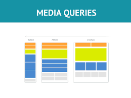
While a fluid layout, created with percentages rather than fixed widths, can carry a design a substantial distance (we cover fluid layouts in full in the next chapter), given the gamut of screen sizes we have to cover, there are times when we need to revise the layout more substantially. Media queries make this possible—think of them as basic conditional logic for CSS.
<strong>Basic conditional logic in CSS</strong>
True programming languages all have some facility in which one of two or more possible situations is catered for. This usually takes the form of conditional logic, also known as "control flow," typified by an if/else statement.
If programming vernacular makes your eyes itch, fear not; it's a very simple concept. You probably dictate conditional logic every time you ask a friend to order for you when visiting a cafe, "If they've got triple chocolate muffins I'll have one of those; if not, I'll have a slice of carrot cake." It's a simple conditional statement with two possible results.
At the time of writing, CSS does not facilitate true conditional logic or programmatic features. Loops, functions, iteration, and complex math are still the sole domain of CSS preprocessors (did I mention a fine book on the subject of the Sass preprocessor, called <em>Sass and Compass for Designers</em>?). However, media queries are one mechanism that allows us to author basic conditional logic—styles applied depending upon whether certain media-based conditions are met.
<strong>Media query syntax</strong>
So what does a CSS media query look like and more importantly, how does it work?
Following is a complete but simple web page with no content but some basic styles and media queries:
<!DOCTYPE html>
<html class="no-js" lang="en">
<head>
<meta charset="utf-8" />
<title>Media Query Test</title>
<meta name="viewport" content="width=device-width, initial-scale=1.0"/>
<style>
body {
background-color: grey;
}
@media screen and (min-width: 320px) {
body {
background-color: green;
}
}
@media screen and (min-width: 550px) {
body {
background-color: yellow;
}
}
@media screen and (min-width: 768px) {
body {
background-color: orange;
}
}
@media screen and (min-width: 960px) {
body {
background-color: red;
}
}
</style>
</head>
<body></body>
</html>
Copy and save that into a new file.
Now, open the file in a browser and resize the window. The background color of the page will vary depending upon the current viewport size.
A default color is defined first, outside of a media query; when any of the media queries are true, the styles inside the media query overwrite the default.
The basic syntax of a media query is simple when you get used to it. You use the @media at-rule to communicate a media query and then write the media test in parentheses. The test must pass in order for the styles within the curly braces to be applied.
You can write media queries in links in HTML—to load particular style sheets if the media query passes. You can write media queries on CSS @import at-rules to determine which style sheets should be imported. You can also write media queries directly into a CSS file to determine which rules should be applied on the basis of which media queries resolve to true.
Let’s look at each in turn.
Media queries in link tags
Here’s what a media query looks like on a link you’d find in the <head> section of markup:
<link rel="stylesheet" media="screen and (orientation: portrait)" href="portrait-screen.css" />
This media query is asking “Are you a screen and is your orientation portrait?”.
Media query on an @import at-rule
Here’s the same rule on an @import statement:
@import url("portrait-screen.css") screen and (orientation: portrait);
[//html]
You can see all the same component parts there—the file to be loaded, and the test that has to be passed. Different syntax, same outcome.
Using the @import at-rule in CSS makes the browser request the relevant file from the network and this can add to the number of HTTP requests. This can sometimes adversely affect site load speed.
<strong>Media queries in a CSS file</strong>
Finally, here's the same media query written inside a CSS file, or, within a style tag inside the HTML:
@media screen and (orientation: portrait) {
/* styles here */
}
Inverting media query logic
It’s possible to reverse the logic of any media query expression by adding not to the beginning of the media query. For example, the following code would negate the result in our prior example, loading the file for anything that wasn’t a screen with a portrait orientation:
<link rel="stylesheet" media="not screen and (orientation: portrait)" href="portrait-screen.css" /
Although using the not keyword is occasionally useful, I find it is far simpler to just think about applying styles when you do want them. This way, you can stick to writing the tersest and simplest forms of media queries.
Combining media queries
It’s also possible to string multiple expressions together. For example, let’s extend one of our prior examples and also limit the file to devices that have a viewport greater than 800 pixels:
<link rel="stylesheet" media="screen and (orientation: portrait) and (min-width: 800px)" href="800wide-portrait-screen.css" />
A number of different media queries
Further still, we could have a list of media queries. If any of the listed queries are true, the file will be loaded. If none are true, it won’t. Here is an example:
<link rel=”stylesheet” media=”screen and (orientation: portrait) and (min-width: 800px), print” href=”800wide-portrait-screen.css” />
There are two points to note here. Firstly, a comma separates each media query, effectively acting like an or command. Secondly, you’ll notice that after print, there is no trailing and or feature/value combination in parentheses. That’s because in the absence of these values, the media query is applied to all media types. In our example, the styles will apply to all print scenarios.
You should be aware that you can use any CSS length unit to specify media queries. Pixels (px) are the most commonly used but ems (em) and rems (rem) are equally valid and applicable.
Everyday media queries
At this point it’s probably prudent of me to repeat that in most situations, you don’t actually need to specify screen. Here’s the key point in the specification:
A shorthand syntax is offered for media queries that apply to all media types; the keyword ‘all’ can be left out (along with the trailing ‘and’). I.e. if the media type is not explicitly given it is ‘all’.
Therefore, unless you want to target styles to particular media types, just leave the screen and part out. That’s the way we will be writing media queries in the example files from this point on. For example:
@media (min-width: 750px) {

    /* styles */

}

